
AIA Peconic Daniel J. Rowen Design Awards / 2018
Announced December 1, 2018.
Portfolio Presentation in Process
~~~~~~~~~~~~~~~~~~~~~~~~~~~~~~~~~~~
AWARD CATEGORIES
Honor Award: The project displays clear excellence in architectural design from concept through completion.
Merit Award: The project displays exemplary execution of design principles and presentation.
Juror Award: Recognizes excellence in resolving specific programmatic desires through interpretation of style, technologies, sustainability, materials, and / or vernacular influences. Juror awards are left up to the jury’s discretion and can be awarded for any project in any category.
People’s Choice Award: Recognizes excellence in architectural design as voted on by one’s colleagues and peers.
~~~~~~~~~~~~~~~~~~~~~~~~~~~~~~~~~~~
—————– Honor Award / Architecture —————–
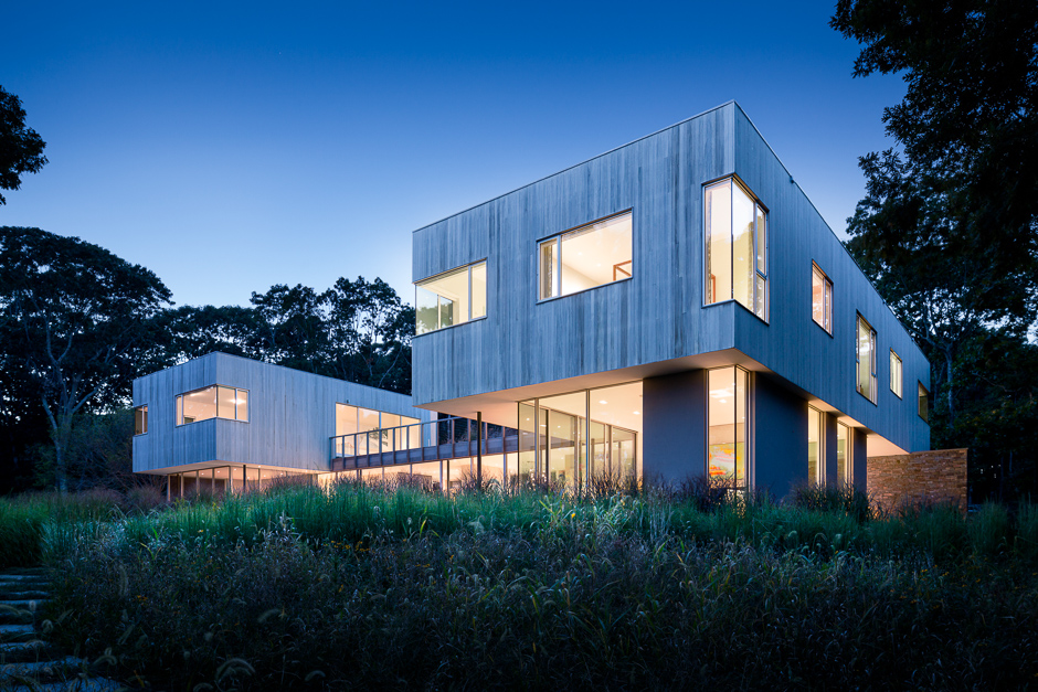
Honor Award / Architecture: Hill House. Architect: Leroy Street Studio.
The Hill House is a modern year-round refuge located on a wooded hillside. The house, acting as a threshold, marks the transition from trees to rolling fields that extend to the distant waterfront. Because it is situated on a nature preserve and protected wetlands, great care was taken to design a home reverential to its location.
The client, a trustee of the Shelter Island Nature Conservancy, requested a home that was sensitively knit into the site with intimate spaces for the family and a large outdoor event space for entertaining. A series of stone retaining walls form stepped terraces in the landscape. Two hovering cedar-clad boxes linked by a multi-purpose roof deck shelter the interior and exterior public spaces below, and house the private components of the program. These two “pavilions” float over a dematerialized first floor made of glass that allows the site’s presence to continue uninterrupted through its section. The house is a mediator between forest and meadow.
The homeowners, both lawyers and law professors, are actively involved with the Island’s preservation and enjoy spending time outdoors. The couple requested space for beekeeping, a chicken coop, and greenhouse. The house includes a green roof and xeriscape landscaping with native plants that do not require irrigation due to restrictions on Shelter Island.
The Hill House has an inherent duality between private living and active, outdoor living. The design team was inspired by the extensive woodland site, which became a ubiquitous element seen in the house’s design, material, program, and form.
The juxtaposition of enclosure and openness is matched by the contrast of modern and traditional materials. The hovering cedar-clad boxes sit on rough fieldstone walls that extend into the landscape and reflect the client’s connection to nature. The use of sleek floor-to-ceiling glass walls on the opposite side coupled with the building’s distinct, minimal form fulfill the client’s desire for modern living. The combination of these contrasting elements results in a timeless design rooted in the site’s existing natural qualities.
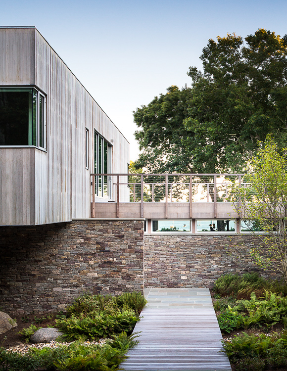
Project Team: Architects Leroy Street Studio. Builder Robert Reylek, Inc.. Interior Design Silkworth Interiors. Landscape Architects Starr Whitehouse. Photos by Scott Frances.

www.leroystreetstudio.com
~~~~~~~~~~~~~~~~~~~~~~~~~~~~~~~~~~~
—————– Honor Award / Architecture —————–
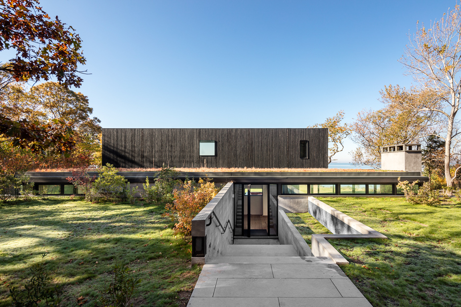
Honor Award / Architecture: Shore House. Architect: Leroy Street Studio.
Perched on the edge of a forest bluff, the Shore House combines a series of sheltered nooks with a flexible entertaining space overlooking Noyack Bay.
The ambition of the design was to integrate the experience and qualities of the site at every scale into the life of the house. To achieve this the architect adopted the additional roles of interior designer and builder. The use of furniture, art, and textiles as abstract elements expanded the density of texture and color, while each day on site allowed the composition of foundations, framing, windows and details to respond to subtle environmental conditions and changing seasons.
Upon approach the cedar façade, charred to match tree bark, and planted roof veil the living spaces. A cut in the earth offers entry to the house followed by a sequence of interior and exterior rooms that open to sweeping views of the bay.
Designed to accommodate large family events, lower living spaces have large glass sliders that open to a covered outdoor courtyard. The central masonry hearth supports the upper volume and provides a focal point for entertaining. A discrete stair provides access to bedrooms and sitting room floating above.
Materials and details of the house are tuned to the rugged nature of the site as well as the personal: exploring the intersection between abstraction and handcrafted materiality. The cantilevered mass and panoramic glazing are juxtaposed against the texture and warmth of charred cedar, brushed oak, blackened steel, troweled plaster, and hand-glazed tiles.
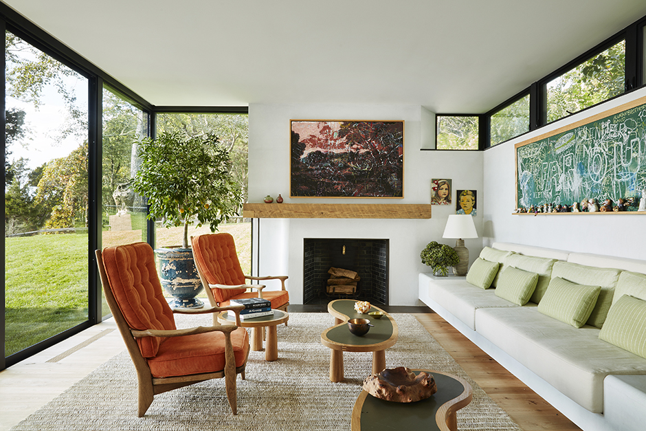
Architects Leroy Street Studio. Builder LSS BLDG, Inc.. Interior Design LSS Interiors. Landscape Architects Edmund Hollander Design. Photos by Scott Frances (exterior) and Pernille Loof (interior).

www.leroystreetstudio.com
~~~~~~~~~~~~~~~~~~~~~~~~~~~~~~~~~~~
—————– Merit Award / Architecture —————–
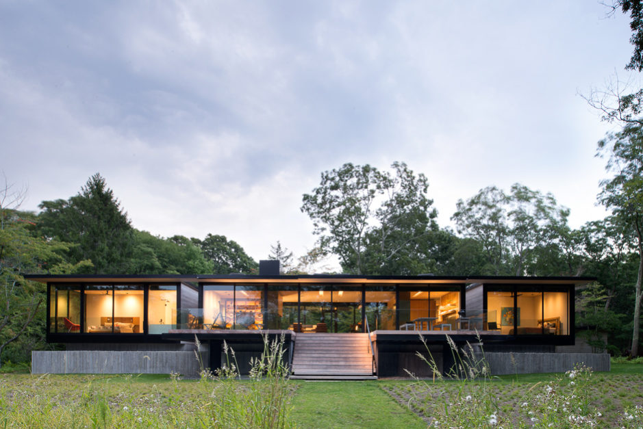
Merit Award / Architecture: Georgica Close. Bates Masi & Architects.
The clients of this new home had been living in a house built in the 1960’s designed by a disciple of Marcel Breuer, one of the “modernist masters”. The site is situated along the shore of a coastal lagoon, and became a victim of the storm surge from Hurricane Sandy. Distraught by the destruction of their home, the clients sought to rebuild in an effort to restore the strong emotional connection they had to the previous dwelling.
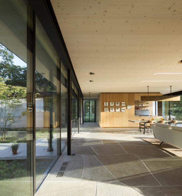
Through research and a careful examination of the previous structure, the qualities the clients admired were carefully considered. First and foremost was the simplicity and truthfulness of the former architecture. It was evident in its exposed steel frame connections and the use of contemporary technologies of the day. To build on these virtues, the new house similarly uses a steel frame to support a roof comprised entirely of Cross Laminated Timber (CLT) panels. This new building system provided an ideal solution, as the panels provide long free spans, can be prefabricated, and bring a warm character to the residence when left exposed. To further celebrate their application, additional building systems are integrated into these prefabricated panels: lights are set into milled recesses, skylights cut through them reveal the solid nature of their construction, and active shading systems are unified with the large roof overhangs. By manufacturing these components offsite, a large portion of the home was delivered and assembled like a kit of parts.
The transverse layering and honesty of assembly exhibited by the CLT panels are further reflected in the detailing in the home. Steel columns in the walls are meticulously revealed, to highlight the structural tectonics at play. The cabinets are constructed of a bamboo plywood that shares a similar lamination technique, mirroring the architecture of the roof at a smaller scale. This commonality is evident when observing the grain direction on the deliberately exposed edges and eased finger pulls. Additional materials seek to heighten the sense of warmth in the home, including large cypress boards that coalesce interior and exterior space, and a burnished bronze fireplace that anchors the central public zone.
To comply with new flood zone requirements for the site, the house is elevated above the previous floor level, and a series of terraces soften the approach to the entry. The interior spaces are arranged on several clear axes, which expand views to the water, and provide perspectives through the architecture to the landscape beyond. These gestures ground the home in the landscape, and reinforce the client’s connection to the natural features of their property.
The architecture’s recognition of history allows the new home to become a familiar part of the couple’s lives, a child of the previous home. Drawing from the client’s memories, the new home becomes meaningful to them, restoring and strengthening their sense of place.

www.batesmasi.com
—————– Juror Award / Architecture —————–
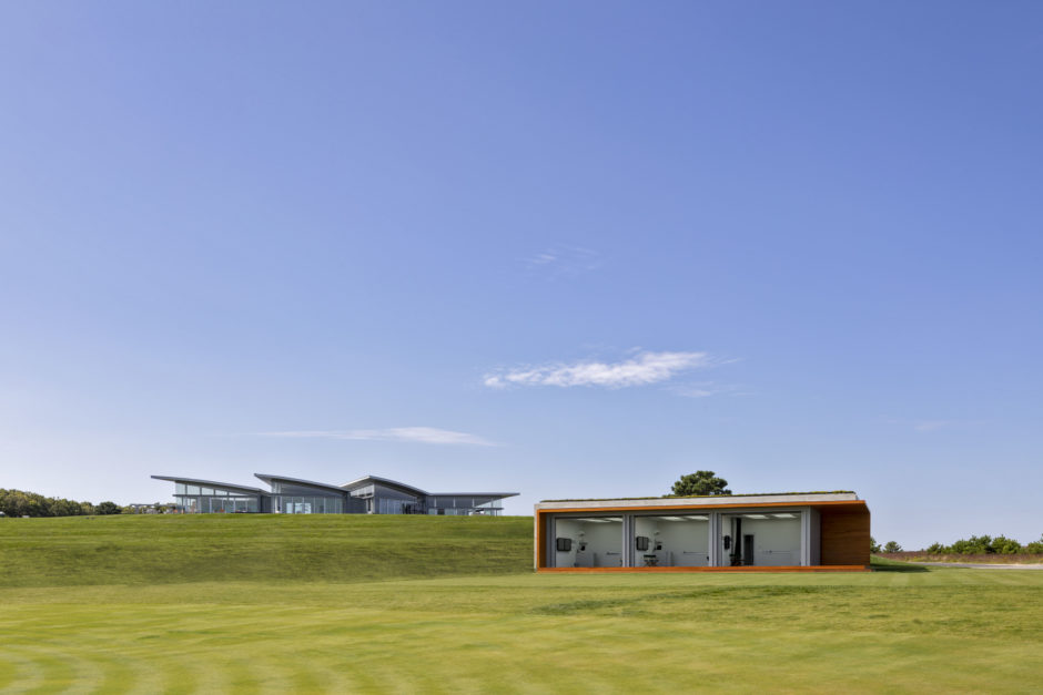
Juror Award / Architecture: The Teaching Facility. Architect: Roger Ferris & Partners.
The design for the Teaching Facility, at The Bridge Golf Course in Bridgehampton, New York, displays minimalist materials in simple formal geometry. The entire structure is built using architectural concrete with additive infrastructure, cyprus and zinc paneling. Special consideration was taken into the design of the facility as to not interrupt the dramatic views seen from the clubhouse. Discreetly set into the hillside, the Teaching Facility features three high-tech bays where players can receive private instruction using state of the art golf analysis technology.
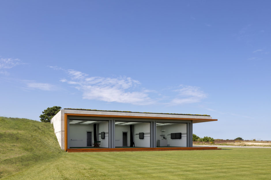
Project Team: Roger Ferris, Robert Marx, Jake Watkins & Frank Guittard.
![]()
www.ferrisarch.com
~~~~~~~~~~~~~~~~~~~~~~~~~~~~~~~~~~~
—————– Juror Award / Architecture —————–
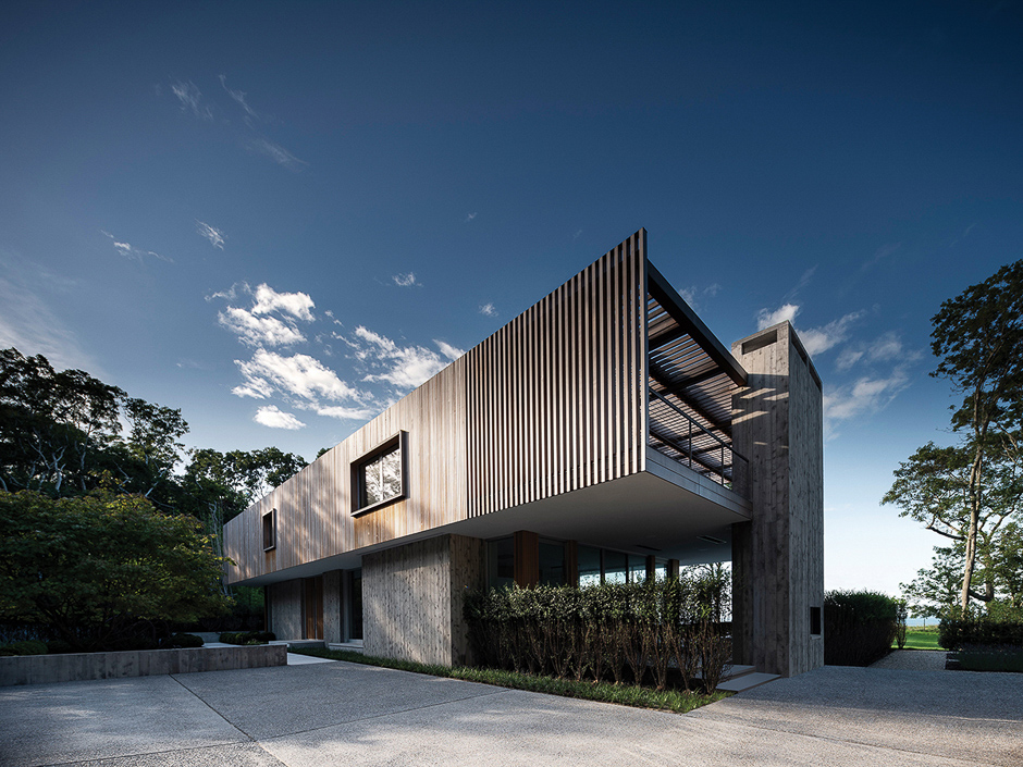
Juror Award / Architecture: House On The Bluff. Stelle Lomont Rouhani Architects.
How we experience our surroundings can have a profound impact on our sense of time and place. Architecture can be a means of exploring this relationship as the buildings, and particularly the houses, we live in have become a sacred refuge in a digital world where boundaries are blurred and information is instantaneous and sometimes overwhelming.
The House on the Bluff explores some of these themes in an attempt to create a retreat for owners with hectic and demanding lifestyles.
The house is separated from the public(street) by a board form concrete wall; solid, permanent and unaffected by nature. A lower concrete wall, another threshold, separates the parking area from an entry garden, where constant seasonal changes become the art in an outdoor gallery.
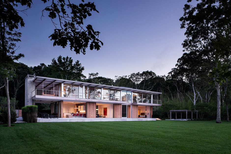
The house sits on a solid concrete base with a void, which is thought of as a gateway. The main floor is designed as an open air pavilion where the doors all pocket, leaving unobstructed views to the bay beyond. From such a high vantage point over the water, the weather becomes a constant source of change and interest.
The upper floor is a much lighter volume, clad in cedar, alternating from solid to void. This volume weathers naturally and is a contrast to the solid concrete base. The cedar shade structures, both vertical and horizontal, provide changing patterns of light and shadow throughout the day, and differ dramatically throughout the year.
Carefully considered materials and details add to an overall sense of serenity and are intended to encourage reflection, concentration or engagement with others without distraction.

www.stelleco.com
Project Architect: Michael Lomont. Architecture Team: Beau Tyler Durham. Interiors: Eleanor Donnelly Stelle Lomont Rouhani Architects.
~~~~~~~~~~~~~~~~~~~~~~~~~~~~~~~~~~~
—————– Honor Award / Historic Preservation —————–
Honor Award / Historic Preservation: Wyndecote. Architect: John David Rose.
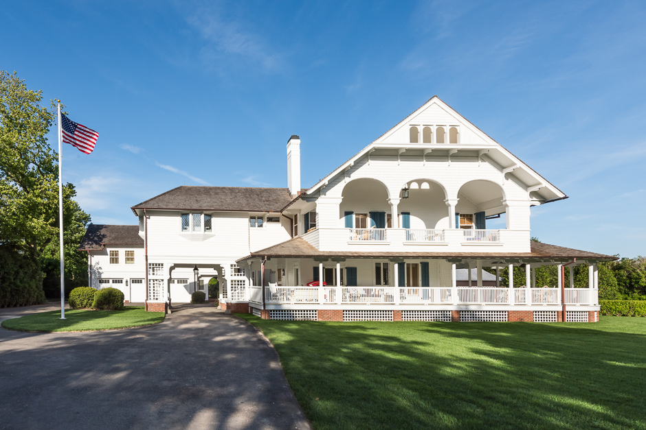
The personal home of Robert H. Robertson, a noted Architect of the Shingle Style, was built in 1887-88 and is a Landmark Building on the National Registry. Included among his numerous works were: Sunnymede in Southampton, New York, Hammersmith Farm in Newport, Rhode Island and the R.H. Robertson’s Rogers Memorial Library and Hall in Southampton, New York. All are representative of the Gilded Age style. The home over the years, up until its present renovation and addition, had fallen into a certain degree of deterioration. Past additions failed to incorporate historical accuracy within this unique home. The roadside elevation with its two-tiered veranda and wrap around porch, provide this home’s definitive look. The most recent renovation and additions are historically accurate while incorporating a three-car garage with a second floor living space. This work included the restoration of the existing stained-glass windows, original exterior and interior trim, including the ornamental main stair and fireplace mantels. The new addition and the existing home were carefully melded together in a timeless fashion so one cannot readily distinguish the work of 1887 and the new work done in 2017. The home was lifted from its original foundation and a poured concrete foundation system was installed. Upon completion of the foundation, the entire original structure was carefully lowered in place to its original location. Both the exterior and interior stay true to the style of the Gilded Age and the homes of historic Southampton Village. The interior was stripped down to its original bones and the historically sensitive items were removed, or protected in place, for preservation. The building envelope was updated to exceed the current energy conservation requirements. All interiors meet the living standards available for a luxury home of 2018 with Smart Systems, fire sprinklers, security system and mechanical systems. The house achieves this level of quality and comfort, while retaining the characteristic and look of a time gone by.
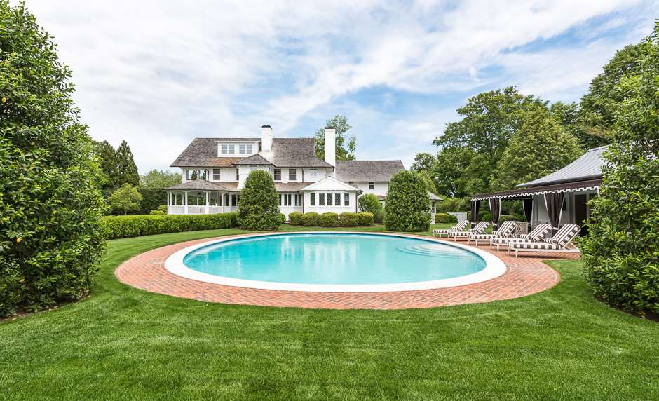
The Landscaping includes a new Pool House with a touch of whimsy and provides a lovely backdrop for the elliptical pool. The new plantings are of correct proportion and location, in order to give a sense of formality, but allows for leisurely living poolside. The site retains many of its mature specimen trees along the perimeter of the property. This secures the timeless quality of this historic contributing home.
Once again, it is hard to distinguish where the work of the past and new, start and end. The house unifies and respects the history of “Time & Place” of the original work. It also has its place in the present, with the incorporation of current building technology. This historic home will remain part of the community’s historic heritage for many future generations.
Project Team: John David Rose Architect P.C. AIA – Architect. JJK Construction – Contractor. Perry Guillot Inc. – Landscape Architect. Austin Harrelson – Interior Designer.
www.johndavidrosearchitect.com
~~~~~~~~~~~~~~~~~~~~~~~~~~~~~~~~~~~
—————– Merit Award / Historic Preservation —————–
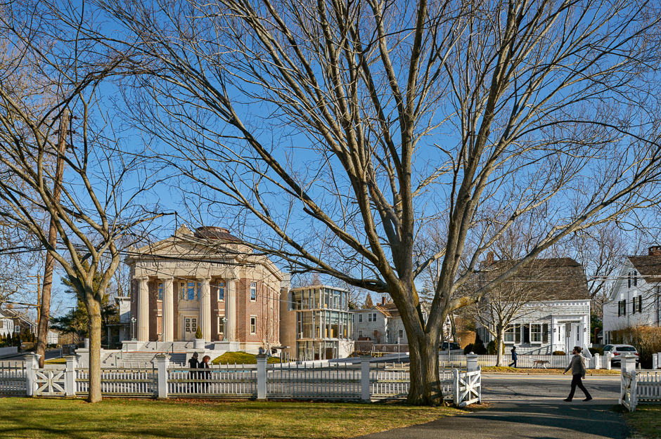
Merit Award / Historic Preservation: John Jermain Memorial Library. Newman Architects.
~~~~~~~~~~~~~~~~~~~~~~~~~~~~~~~~~~~
—————– Honor Award / Projects —————–
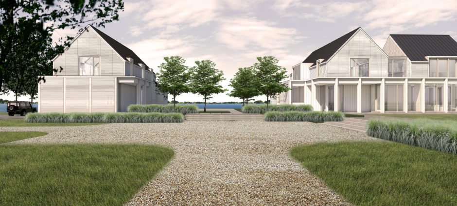
Honor Award / Projects: Shelter Island House. James Merrell Architects.
“Modernity in no way denies history.” -Jorge Gleiter
The dominant architectural aesthetic of our times is modern, and minimal, but historical contexts matter too. And this project, located on historically-Victorian Shelter Island, NY., brought all these questions to the fore for us. In locations like this one architects most often chose between two polar-opposite approaches. They either stick with the idea of an international style and reject historical context, or they adopt a Post-Modernist strategy and mimic regional styles. However, for us neither approach appealed.
Our site sits on the bluffs near Shelter Island Heights, with big water views to the west and 19th Century cottages all around. So we started our design process by abstracting one of the most salient characteristics of that Queen Anne architecture – its central gable with wraparound porches. But instead of continuing in that Victorian vein, we developed instead a rigorous, even Rationalist, geometry to organize our abstraction. And with this geometry, we hoped to counter-balance the Victorian sensibility and bring aspects of both centuries into one design.
To understand all this better please take a look at our plans and diagrams. There you will see that our initial porch-wrapped volume was (conceptually) replicated, slid and rotated twice to the north, and once to the south. The slide/rotation to the north was suggested by the angle of the beach and best water views, and it produced a point-symmetrical geometry which emanates from the center of the living room. The slide/reflection to the south was produced by a more classical bilateral symmetry, aligned about the short axis of the pool. And this created the outdoor “room” that now organizes the house and pool/guest house structures.
With regard to our building section and elevation renderings, our underlying geometry also proved influential. As you can see in those renderings, our column, rain-screen and roofing details all evolved right out of our planning “math.” And that was an exciting discovery for us, because it made our Victorian-influenced architecture more classical in nature.
In the end, we hope this design alludes equally to the richness of Victorian style and context, while also speaking to our times in the early 21st Century. Perhaps our design also demonstrates that architects can embrace history without necessarily being limited by the historical – that modernity need not deny history in design.
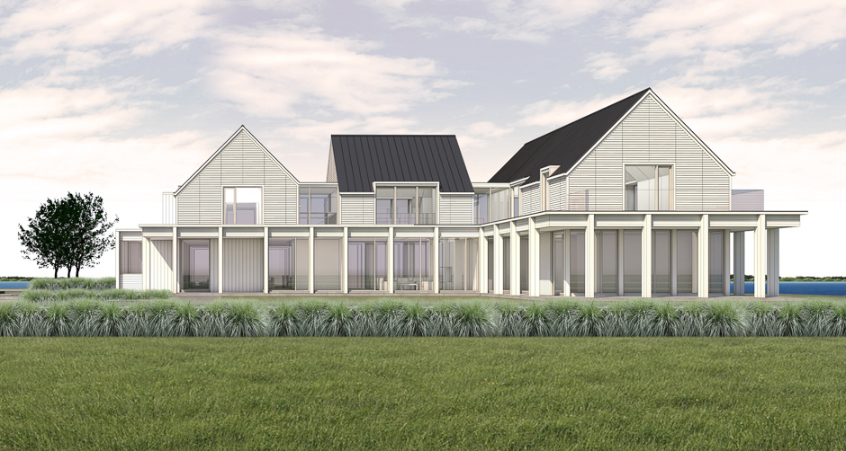

jamesmerrellarchitects.com
Project Team: James Merrell, Stephen Soule, Aaron Proulx
~~~~~~~~~~~~~~~~~~~~~~~~~~~~~~~~~~~
—————– Merit Award / Projects —————–
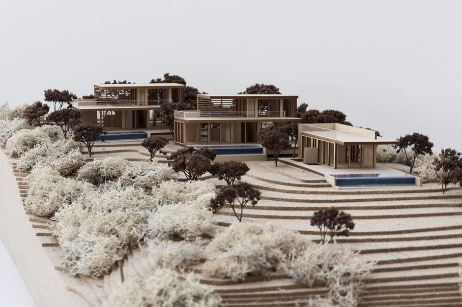
Merit Award / Projects: Bluff Crest Cottages. Stelle Lomont Rouhani Architects.
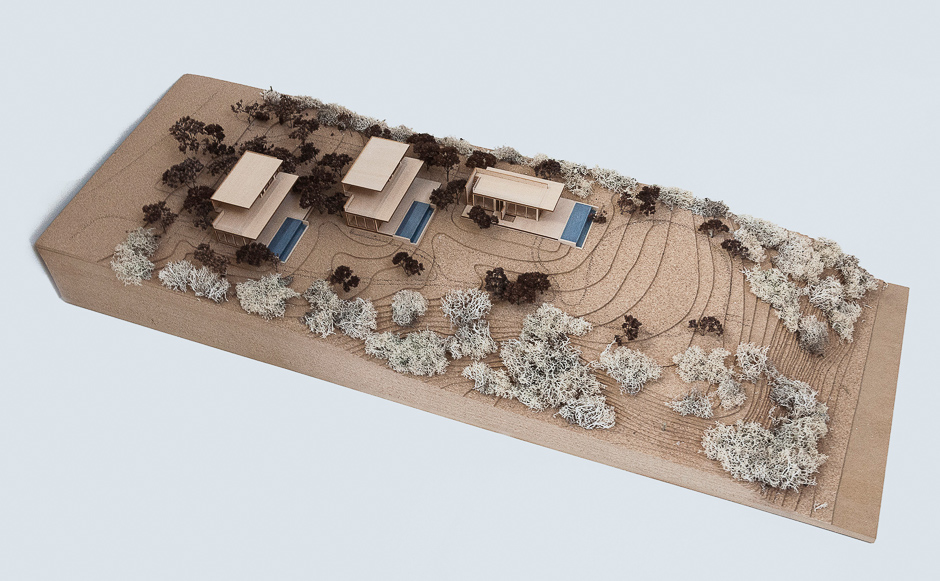
The Bluff Top cottages are located on a west facing bluff with fantastic water views. Aimed to replace four existing cottages in desperate need of repair, these modestly sized structures will continue to serve as individual resorts. As part of an eclectic neighborhood dotted with houses and cottages of various sizes and appeal, these buildings strive to blend into their surroundings with low flat roofs and wood cladding meant to weather. Currently the lot is barren and underdeveloped from a vegetated stand point. The goal with the help of Landscape Architects and Environmental Specialists is to transform the lot into a lush native vegetated area. The trees and plants will not only bolster the bluff itself but weave themselves up and around the structures creating privacy while allowing for focused views from each of the staggered cottages. With two of the buildings just shy of 1200 sf and one at 800 sf, each comes equipped with eat-in and eat-out opportunities. Small but private pools and expanses of either second floor or roof decks afford each place sunset views over the water. Easy indoor outdoor living and access to a shared outdoor area is enjoyed by all three.
This project will employ a new low-nitrogen septic system. The time for sustainability is here, and this project aims to tread lightly and give back to the environment.

www.stelleco.com
Project Architect: Viola Rouhani. Architecture Team: Jonathan Subject.
~~~~~~~~~~~~~~~~~~~~~~~~~~~~~~~~~~~
—————– Honor Award / Emerging Architects —————–
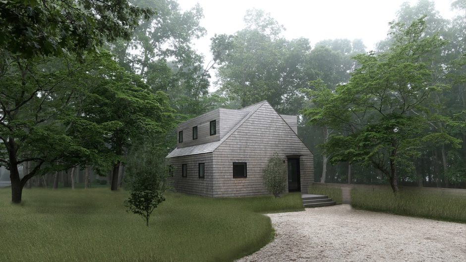
Honor Award / Emerging Architects: House 184. Architect: The Lacuna Project.
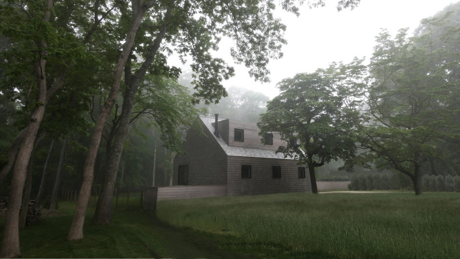
Two key conditions set the initial framework for the design of this 1000 s.f. two bedroom, two and one-half bathroom cottage: First, was a moratorium on new construction permits at the time that the project began. Thus, house 184 was designed to fit within the footprint and volume of an existing 1950’s four-bedroom one bath Cape home, which allowed for regulatory approval of the project as a renovation. Second, was the clients’ mandate for the project, “Give us everything we need and nothing we don’t.”
The parti for house 184 is the imposition of a box within the gabled Cape form. The Cape has been reduced to its most essential geometry. On the first floor the box is contained within the original footprint providing a core with kitchen, powder room and entry bench/closet. On the second floor the box protrudes through the gable volume creating two large dormers with space for the bedrooms and bathrooms.
In a place and time where the supposed luxury of gross excess is all too prevalent, the design of house 184 aspires toward the luxury of simplicity and refinement, excluding decoration and leveraging minimalist detailing. In a time and place where architectural discourse is too often reduced to a question of “traditional” or “modern”, house 184 looks beyond reductionist dialogues by working with the architectural elements of gable and box, facade and core, through a contemporary lens.

www.thelacunaproject.com
~~~~~~~~~~~~~~~~~~~~~~~~~~~~~~~~~~~
—————– Architecture Award / Peoples Choice —————–
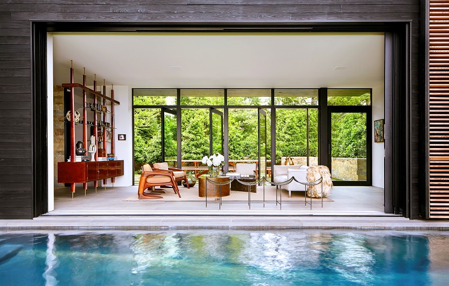
Peoples Choice Award: South Harbor. Blaze Makoid Architecture.
============================================
2018 AIA Peconic Jurors
F. Eric Goshow, FAIA LEED AP BD+C / Goshow Architects
Christopher Cooper, FAIA LEED AP /Skidmore, Owings & Merrill
Graham S. Wyatt, FAIA / Robert A.M. Stern Architects
Patrick Burke, AIA / Michael Graves Architecture & Design
============================================
VISIT PREVIOUS AIA PECONIC AWARD PORTFOLIOS
-
AIA Peconic: 2013 Daniel J. Rowen Memorial Design Awards
-
AIA Peconic: 2014 Daniel J. Rowen Memorial Design Awards
-
AIA Peconic: 2015 Daniel J. Rowen Memorial Design Awards
-
AIA Peconic: 2016 Daniel J. Rowen Memorial Design Awards
-
AIA Peconic: 2017 Daniel J. Rowen Memorial Design Awards
————————————

~~~~~~~~~~~~
