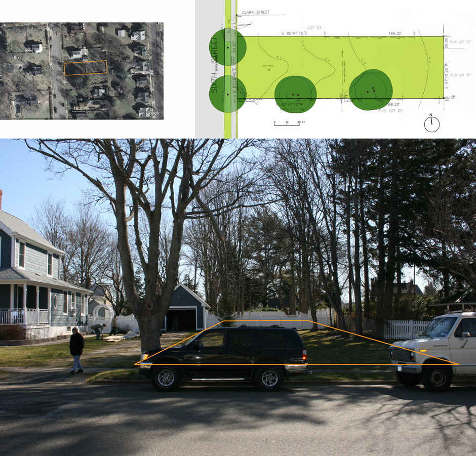
While the client wanted a sense of “openness,” the selected site was a skinny, long lot, 50-foot wide x 166-foot deep, with trees the owner wished to keep. It was clear that any standard compact plan would not work as two sides would be close to the boundary. Only limited rooms facing the backyard would have opened freely to the outside.
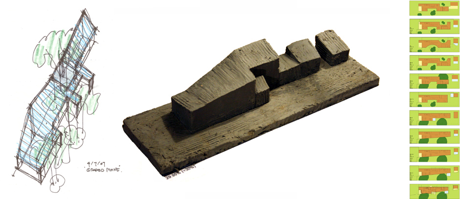
Keeping as many trees as possible, we started to sketch comb-like, interlocked configurations, which attempted to merge interior and outside environments. However, it became clear that this approach would not work either. The schemes appeared too complicated for the scale.
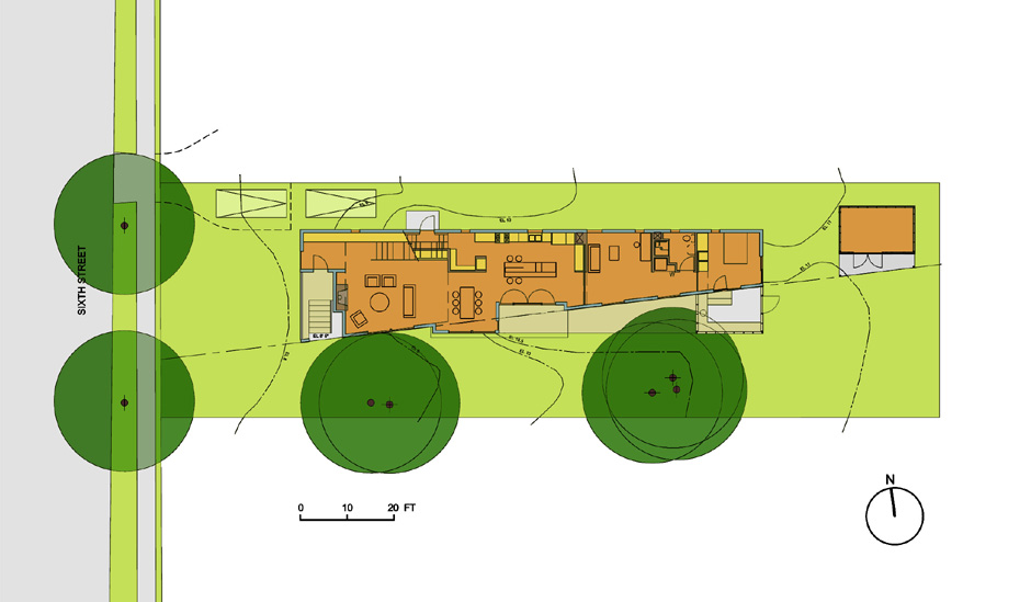
The answer was to replace the comb-interlocked plan with a straight, diagonal wall, which provided openness and maximum connections between the interior and exterior spaces on this narrow site.
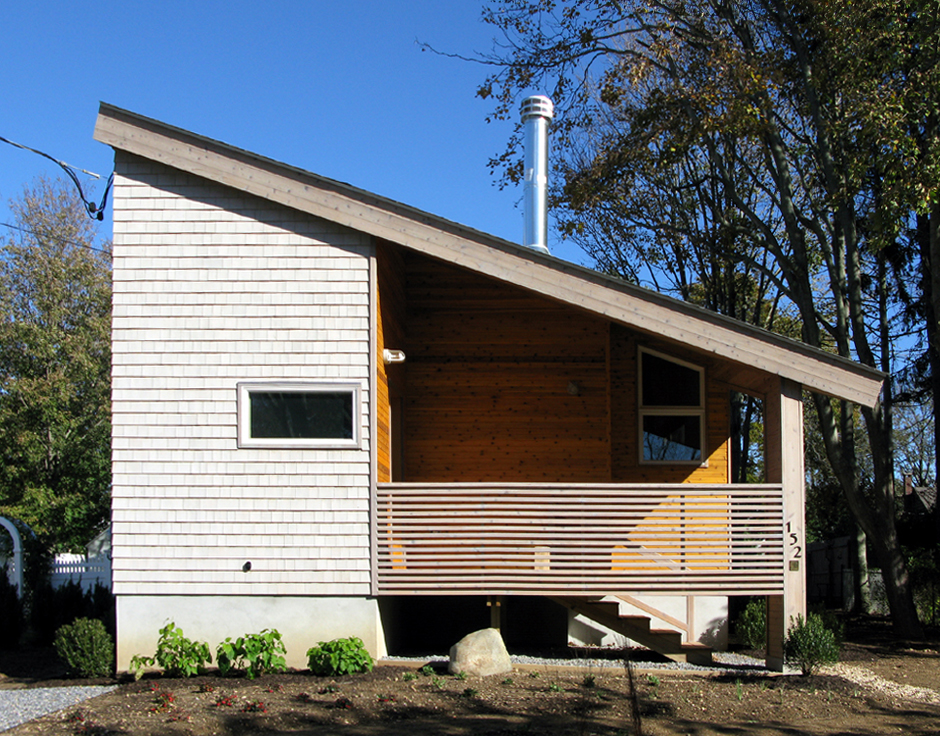
The street façade uses the maximum width allowed, protecting privacy while using a layered approach. Photo: Tony Holmes.
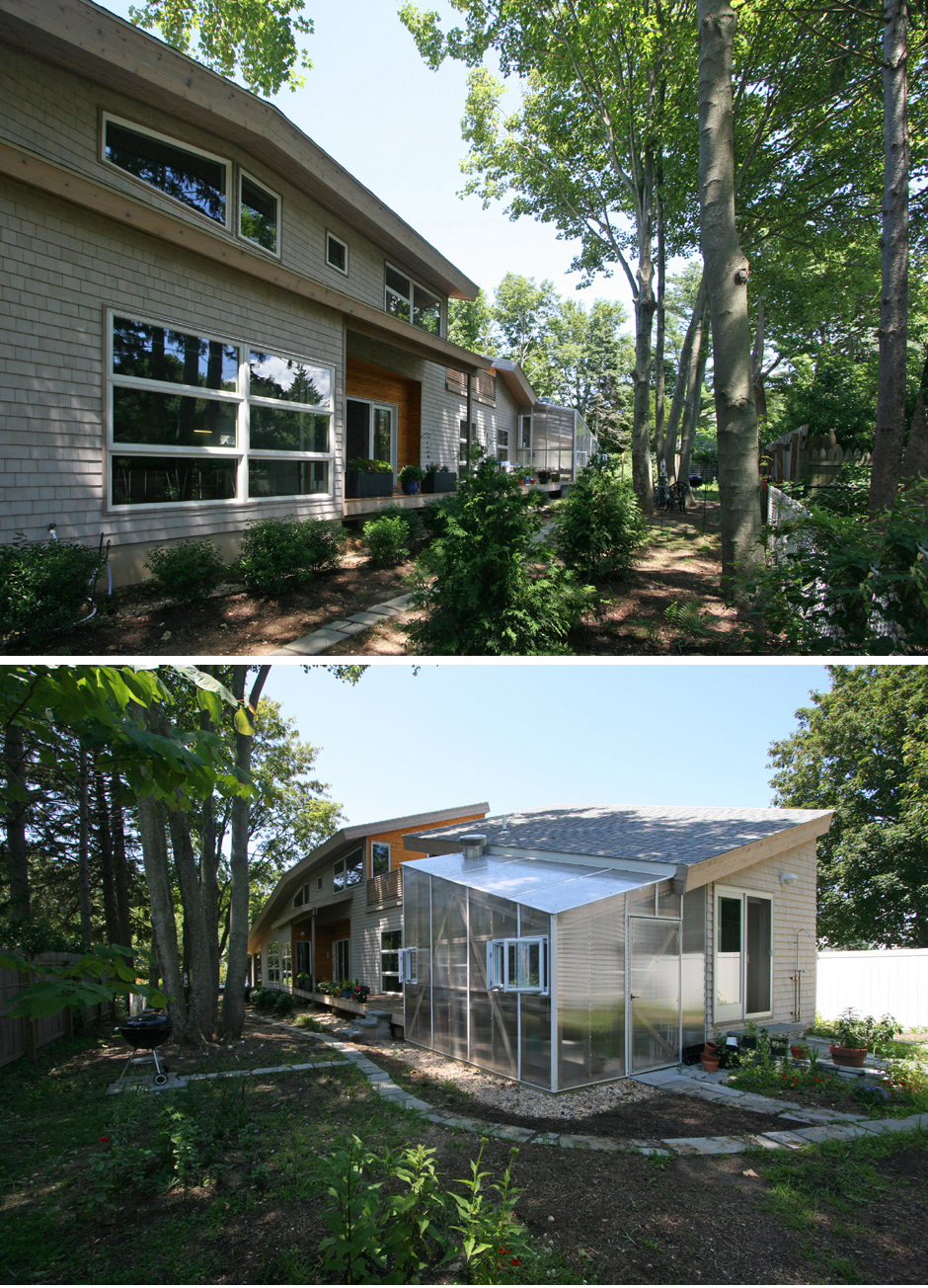
A diagonal wall running from the southwest to the northeast divides the site into two equally divided zones: “dwelling” and “garden”. The interior space uses the widest possible width at the western end; while the garden widens on the eastern end. Photo: Tony Holmes.
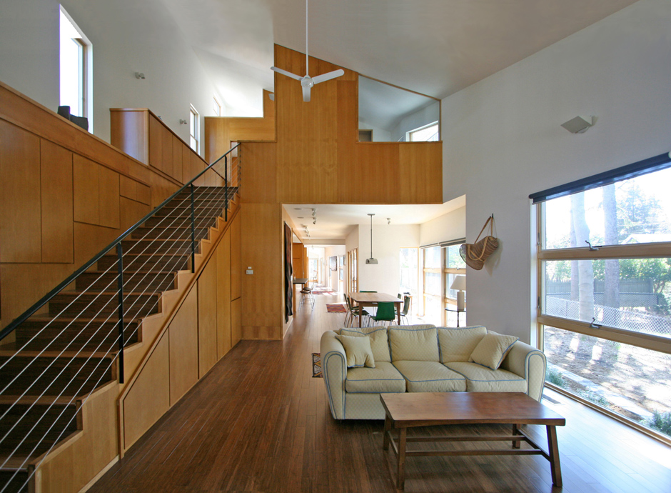
The diagonal wall provides wide, angled openness to all interior spaces. The scale sequentially changes from grander public spaces, to more intimate rooms.
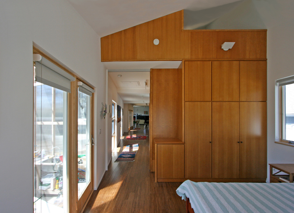
Intimate room at the far end of the diagonal wall. (Large pocket doors separate private areas.)
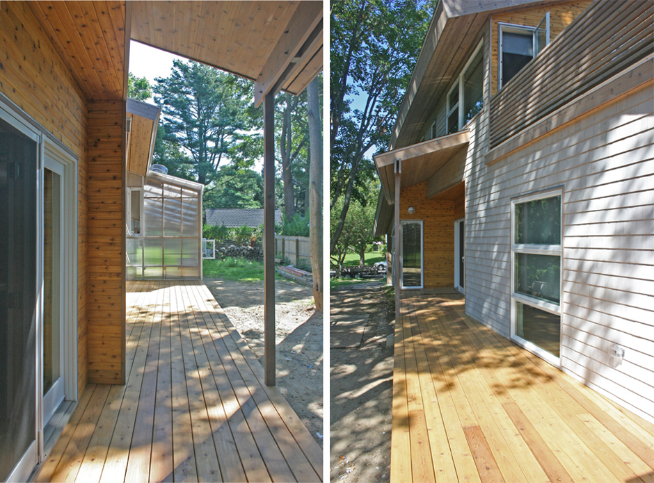
The diagonal wall emphasizes the perspective view. When looking west to east, the distance seems shorter, drawing the garden closer.
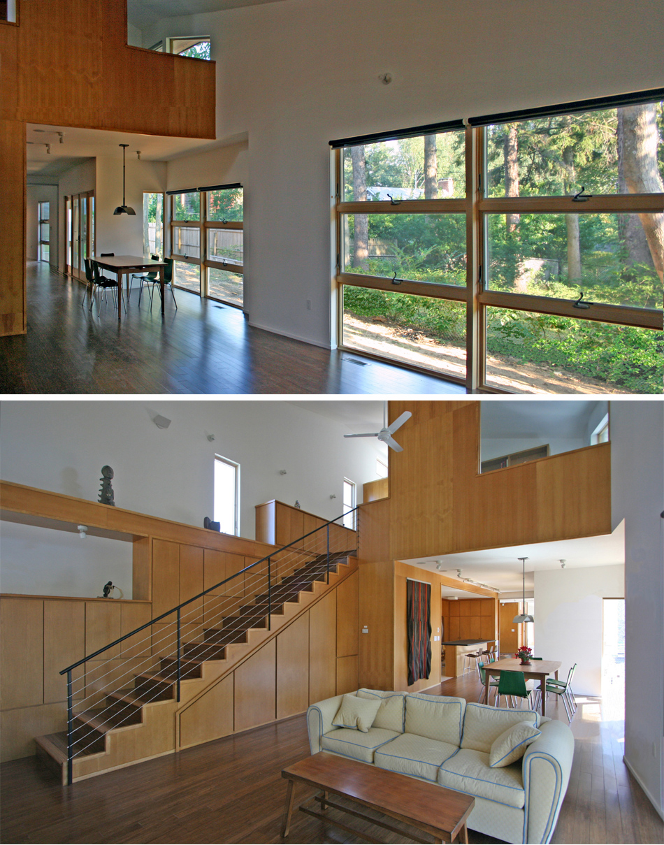
While the diagonal south wall has large openings, the north wall houses functions including staircases, closets, cabinets, duct spaces, art presentation shelves, kitchen, laundry, and bathroom, with minimally sized windows. The contrast reinforces the openness on the diagonal wall.
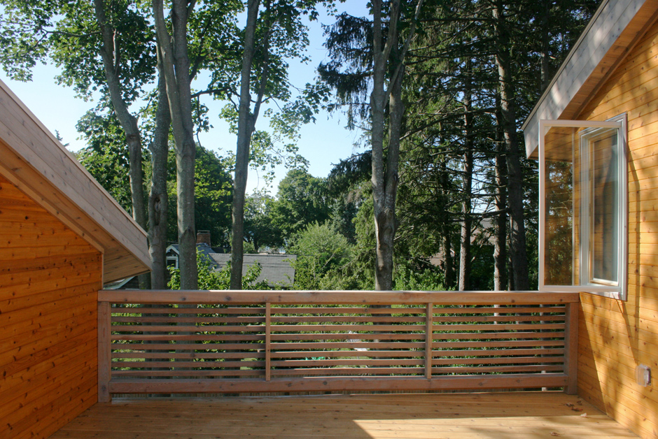
Although the interlocking form was replaced with a diagonal wall, a vertical interlock was reintroduced. A cut was made in the continuous roofline to provide a private roof deck adjacent to the master bedroom.
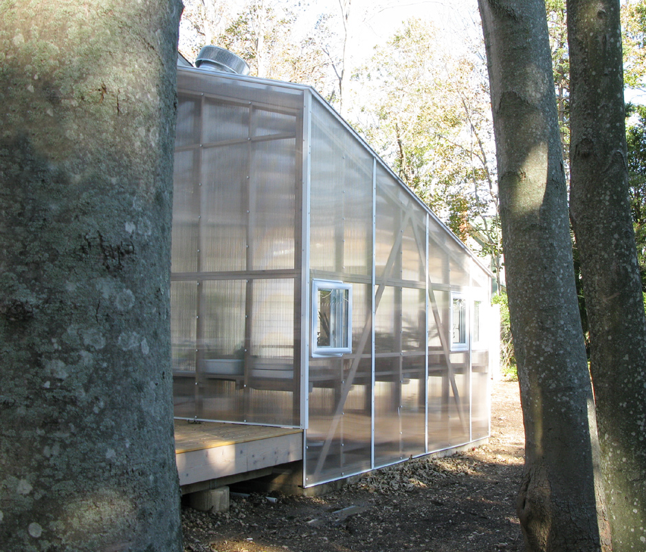
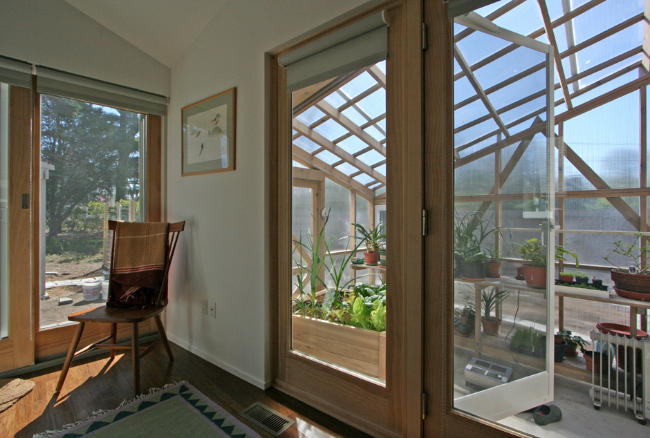
A greenhouse was attached to the east end of the diagonal wall to add layers of interconnections between outside and inside spaces.
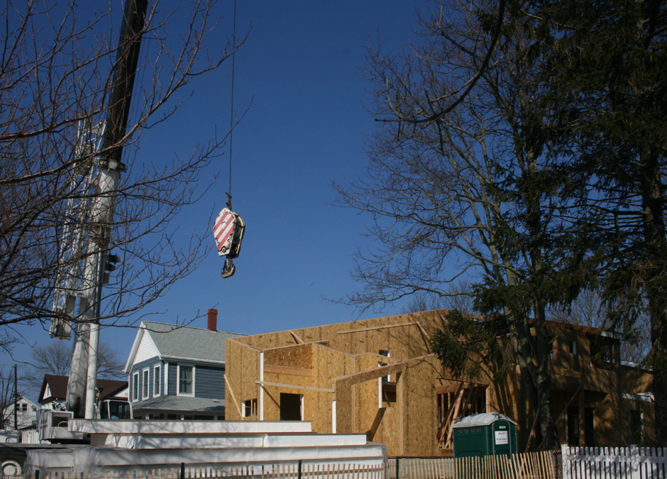
The shed roof slopes toward the south to accommodate a future solar panel installation. To minimize the building volume, the roof slopes down diagonally at both eastern and western ends. The combination of the diagonal wall and the diagonally sloped roof creates delicate angles at the wall/roof connections. We used SIP (structural insulated panels). While SIP provides superior insulation and a tight envelope, it is also perfect for the delicately angled connections, since the panels are factory cut and beveled.
PROJECT TEAM:
Hideaki Ariizumi project architect
Glynis Berry project partner
studio a/b architects
651 West Main Street, Riverhead, NY 11901
www.studioabarchitects.com
631 591 2402
CONTRACTOR:
Chris Kyprianou
CABINETRY: Concepts in wood of CNY, Inc.
PROJECT LOCATION:
Greenport, NY
CONSTRUCTION DATES:
Excavation: December 2007
Completion: November 2008
SIP MANUFACTURER:
Winter Panel
———————————————————————————-
Photo credits: studio a/b architects, except by Tony Holmes, as noted.
Portfolio images & copy provided courtesy of Hideaki Ariizumi, studio a/b architects, Riverhead, New York
