~ ~ ~ ~ ~ ~ ~ ~ ~ ~ ~ ~ ~ ~ ~ ~ ~ ~ ~ ~ ~ ~
2021 AIA Peconic Design Awards
January 9, 2021
AIA Peconic announced the winners of the 2021 Daniel J. Rowen Design Awards Program at a virtual event on January 9th held on ZOOM and hosted by Richard Stott AIA and Debbie Kropf AIA. In 2021 the nine design awards were presented via technology following the jury decisions. AIA 2021 Jurors — David Businelli AIA, Katherine Chia FAIA, Illya Azaroff AIA and Brian Carter, Professor, School of Architecture & Planning, University of Buffalo.
Our jurors found this a rewarding challenge reviewing over 27 projects. The projects were identified and subsequent awards were presented that recognized architecture, historic preservation, unbuilt projects and emerging architects and through the lens of their projects answered––
“How does this project address issues
of time and place?”
——————–
AWARD CATEGORIES
Architecture Award celebrates outstanding architecture regardless of project size, budge, style, or building type.
Honor Award: The project displays clear excellence in architectural design from concept through completion.
Merit Award: The project displays exemplary execution of design principles and presentation.
Historic Preservation — Adaptive Reuse Award acknowledges projects that restore, remodel, preserve or re-purpose existing buildings of any style or type.
Emerging Architects Award applauds projects in the early stages of an architects career for design innovation.
Unbuilt Projects Award recognizes unbuilt architecture, planning, urban design, and research.
~~~~~~~~~~~~~~~~~~~~~~~~~~~~~~~~~~~
—————– Honor Award / Architecture —————–
Sagg Farm: Bates Masi + Architects
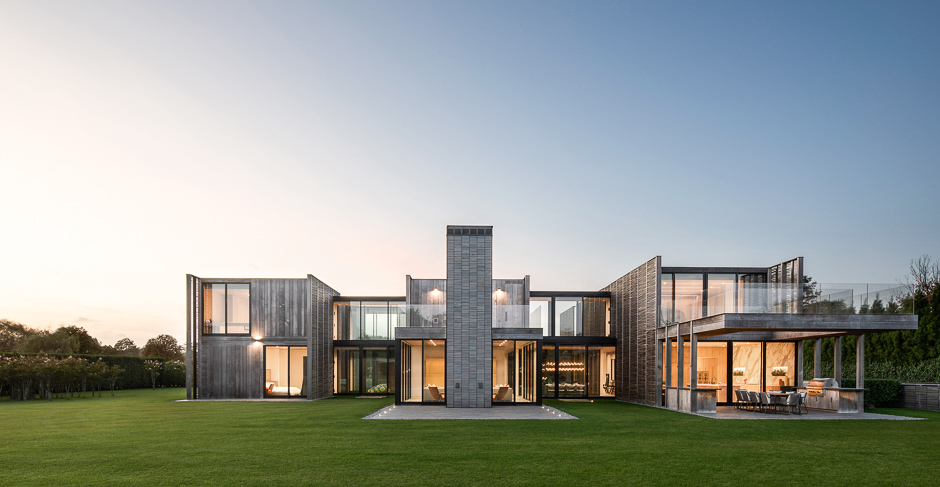
Sagaponack, with its flat terrain and fertile loam, has historically been a farming community set within the resort enclaves on the East End of Long Island. The open expanses of its potato fields sat in contrast to the forests and gardens of the surroundings. In recent years, fueled by its proximity to the ocean, the tide of development in Sagaponack has been steady and inevitable. Farm fields have given way to residential subdivisions. This project seeks to honor the agricultural traditions of the area by applying the fundamental principles of agriculture to architecture: placing order on nature and maximizing access to light and air.
The majority of crops in Sagaponack were row crops as opposed to field crops, they were spaced apart in ordered lines to maximize each plant’s exposure to sunlight. In this region, rows were oriented north/south so as not to shade one another and to align with the prevailing southerly wind, thereby improving pollination and reducing erosion. Acres of north/south rows gave the community a grain and orientation. These principles are applied to the form of the house, which is separated into parallel bars spaced equidistant apart to admit sunlight and fresh air. Breezeways of operable glazing connect the more solid bar forms while allowing the passage of light and wind. The plantings, trees, and paving of the landscape design, which are similarly organized into parallel rows, extend between the bars of the house into courtyards, intertwining the house and the land. Breaking the home into multiple volumes has the added benefits of reducing its apparent mass and enhancing the privacy between spaces.
What is good for nature is also good for people. And so, by applying the principles of farming to architecture, the house is made more comfortable and more beautiful. At the same time, the disappearing character of the place is recorded in the design.
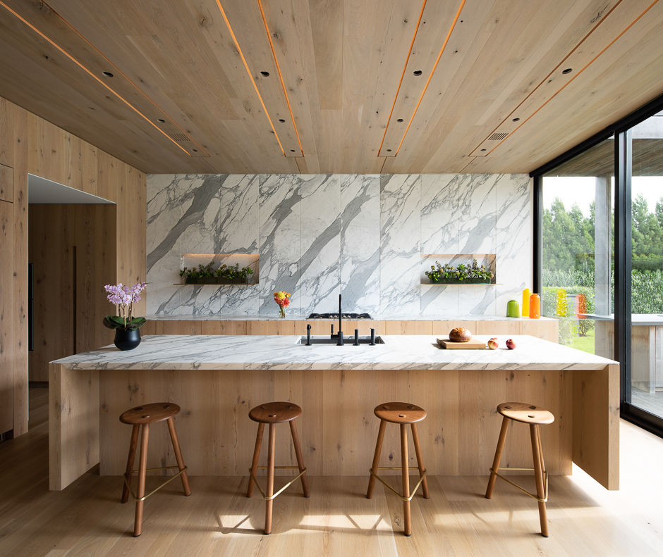
Agriculture juxtaposes organic plant forms with meticulously cultivated straight rows. This beautiful contrast inspired the treatment of materials in the architecture. The dimensions of the house are broken down to a 4′ module in both plan and section. This 3-dimensional grid governs the placement of everything from walls to light fixtures. Materials are selected and manipulated to defy the strict order. The rainscreen siding of thin cedar strips was installed green and fastened with only 2 screws at the center. The unfastened ends of each board are free to warp according to their grain direction, creating an organic pattern within the rigid framework. The pattern will further change over time depending on the exposure to the sun and rain. Inside, stone with prominent veining was selected to contrast the otherwise crisp lines. At the stair, rows of wood balusters are free to rotate around their supports. Felt louvers on each baluster serve as acoustic absorbers and catch the wind or a passing hand to rotate the balusters, continually changing the pattern.

~~~~~~~~~~~~~~~~~~~~~~~~~~~~~~~~~~~
—————– Honor Award / Architecture —————–
Lathhouse: Birdseye Architecture
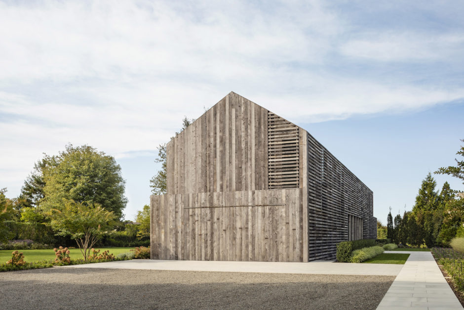
The architectural context of Sagaponack is a dense layering of modernism, contemporary refinement, historicism, and rural farmland. Lathhouse is a regionally inspired home conceptually influenced by the local agricultural history combined with contemporary programming, modernist convention, sustainable building systems and materials, and a reverence for vernacular form.
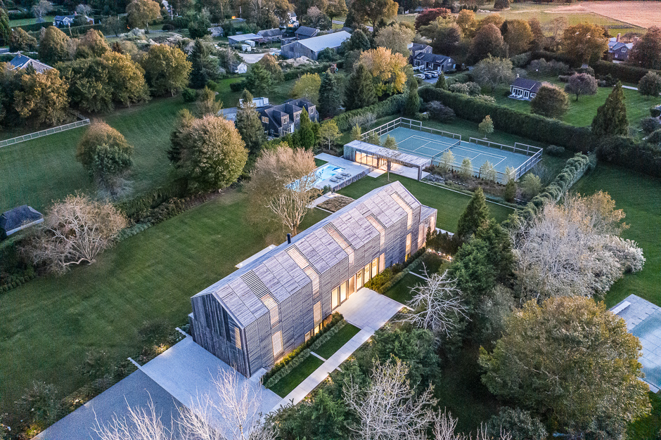
Lathhouse reflects a purposeful agrarian context, much like a barn in its pastoral setting. The residence, a two-story gable structure, is oriented east west overlooking a spacious lawn to the south. The sloping topography, coupled with the minimalist pool house, defines the lower lawn, pool, and tennis court. The pool house mediates between the pool and tennis court activities. The perimeter is defined by a continuous privet hedge and anchored by mature deciduous trees.
The architecture of Lathhouse is conceptually inspired by the eponymous lath house, a traditional gabled farm structure made primarily of wood laths or slats spaced to reduce sunlight while permitting ventilation. This wood detail is also found most notably in corn cribs, drying barns, and livestock shelters.
At Lathhouse, the main residence is clad in a regimented composition of slats over the noirth and south walls and roof. The slats are both contextual and purposeful, reimagined as siding that functions to provide privacy screening, to limit interior light emittance, and used as solar shading. The slatting extends over windows and skylights on the north facade for privacy and on the south function as a solar shading scrim. The detail also wraps to each bedroom window creating inset Juliet balconies. The upper south wall slats end at a large second floor overhang datum that defies the indoor/outdoor experience. Operable glass walls open to a large stone terrace off the living room and the kitchen opens to a wood slatted pergola covered porch. The pool house emulates the cantilevered pergola, operable glass walls, and rain screen details of the house.
The singular exterior material of weathered wood cladding reflects a timeless patina reminiscent of the barns and outbuildings in rural landscapes. The siding is reclaimed from decades-old corral board fencing. The repurposed wood, electrically based geothermal heating and cooling, closed cell polyurethane insulation, mechanical fresh air system, and insulated high efficiency windows all contribute to the efficiency in the design and sustainability of the house. Water collection is through a concealed gutter and downspout system and dispersed evenly to mitigate erosion. All lighting is LED.
The project program consists of a garage, mudroom, guest suite, living, dining, kitchen, principal bedroom, suite, three bedroom suites, laundry, and linen storage. The lower level contains a guest suite, gym, wine storage, tv room, bunk space and mechanicals. The pool house structure supports a changing room, bathroom, lounge area and open pergola sitting space.
The interior finishes and furnishings of the house are inspired by the light and shadow play of the slats over the wall and roof glass. The clean design aesthetic, scale and detail of bespoke furniture pieces and custom designed cabinetry reflect a depth of craft congruent with the architecture experience.
Birdseye Team: Brian J. Mac, FAIA; Jeff McBride, AIA, LEED AP BD + C; Andrew Chardain, AIA. Interior Designer: Brooke Michelsen Design. Contractor: Wright & Co. Construction Inc. Landscape Architect: Wagner Hodgson Landscape Architecture. Structural Engineer: Engineering Ventures. Photography: Michael Moran Photography.

~~~~~~~~~~~~~~~~~~~~~~~~~~~~~~~~~~~
—————– Honor Award / Historic Preservation —————–
Asset: Bates Masi + Architects
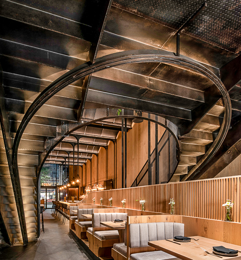
The architectural character of Manhattan is a palimpsest. As buildings are renovated and added to over centuries traces of each iteration remain, expressing themselves as an oddly placed column or a texture that bleeds through successive layers of paint. In the renovation of 329 Columbus Avenue to create Asset restaurant, we sought to excavate the existing space in search of unique textures and hints of the past that would enrich the guest experience.
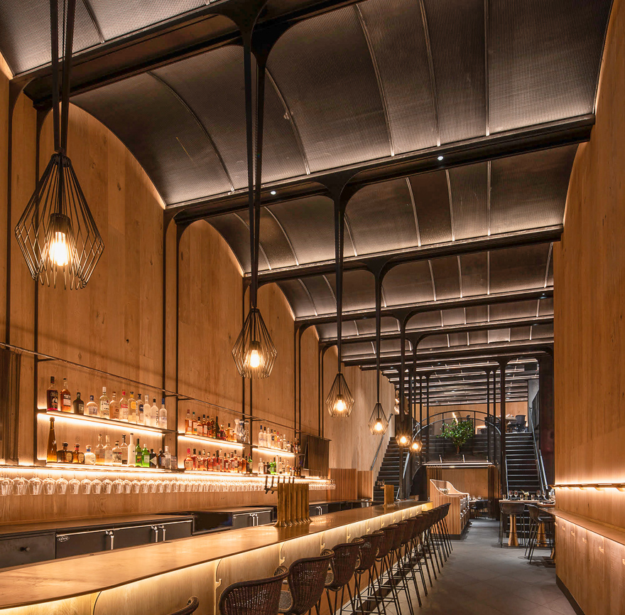
In the process of 3D scanning the building, vaults of expanded metal lath were discovered above the fire rated ceiling. The vaults were reintroduced as an exposed element serving multiple functions. Formally, their rhythm breaks down the expansive space to a more intimate space. Structurally, they conceal steel girders, below which are hung the stair, bar shelves, and light fixtures, allowing those elements to be much more delicate than if they were self-supporting. Depending on the size of the openings in the expanded metal and how it is lit, the material can be manipulated to adjust its transparency. Thus it can be used as a delicate stair guardrail; or expanded to serve as a ventilation grille; or paired with insulation to become an acoustic absorber; or layered to conceal mechanical equipment; or stretched to hold wine bottles. The diamond pattern of the expanded metal becomes a motif unifying the details from the pattern of the stone floor to the bathroom mirrrors and umbrella stand.
The process of excavation was also applied to the oak panelling on the walls. The boards were sandblasted to erode the soft earlywood that lies between the harder latewood grain, thereby enhancing its character and increasing its sound absorption. Areas of the panelling were masked off from the sandblasting, creating a sharp line of contrast between the eroded portions and smooth portions.
The mezzanine, itself a remnant from a past iteration of the space, provides a unique dining experience overlooking the bar below and the street beyond through the 2 story glass curtain wall facade. A grand stair connecting the levels is divided in 2 parts, 1 side for service and the other for guests. The 2 sides merge in a gentle curve reminiscent of the ceiling vaults. Under the mezzanine the more intimate space can be divided into private dining rooms by expanded metal screens. Light grazes across the screens in this application to reduce their transparency.
With the thoughtful manipulation of a limited palette of materials, each of which reflecting a bit of the history of the space, the former retail store is transformed to create a variety of dining experiences: lively parties at the bar, special family occasions in a private dining room, the intimate banquette seating. Each space is tailored for a special experience but is cohesive in its material and details.

~~~~~~~~~~~~~~~~~~~~~~~~~~~~~~~~~~~
—————– Honor Award / Emerging Architects —————–
Brookhaven: WE+ Architects
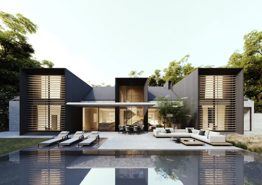
This steeply sloping site provided an opportunity for a residence that cascades down a heavily wooded lot. Designed for a young family of five, the home is laid out simply and symmetrically for a legible yet luxurious user experience. The basement and entry garden of this 5700 sf residence anchor in one corner while the top two floors peel off at a 30 degree angle. This allows for the spatial needs of the family to be met while taking advantage of the longest edge of this peculiarly shaped lot.
The parti of the home is based on an uncompromising 14’ grid. Each vertical box cuts
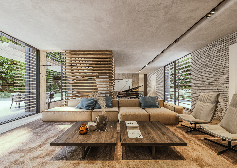
into the 98’ long rectilinear form at alternating intervals. The landscape design respects this grid, but also intentionally frees itself in order to break up any lingering monotony. Cascading steps lead guests from the parking up to a powerful entry, while the interior staircase from the garage lands in an intimate mudroom on the main level. This staircase then reappears as a feature element on the main floor, providing central circulation between floors for the family. The backyard, surrounded by a sloped retaining wall, hugs the two story vertical boxes and is given a human scale through a louvered overhang.
All in all, the design objective was to introduce a simple, contemporary aesthetic to a family in Atlanta who previously thought this style of home was out of reach. A regular structural grid, limited unique conditions, concentrated glazing, and use of stock material sizes, all contributed to a design that stands out in its unique aesthetic, not its price point.

~~~~~~~~~~~~~~~~~~~~~~~~~~~~~~~~~~~
—————– Merit Award / Architecture —————–
Pike & Pond: Oza Sabbeth Architects
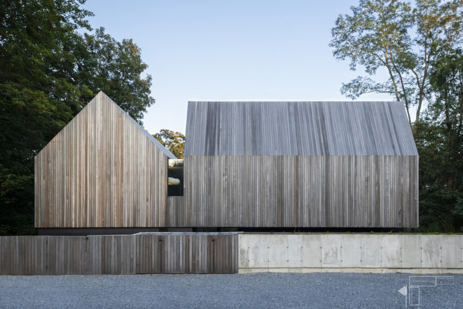
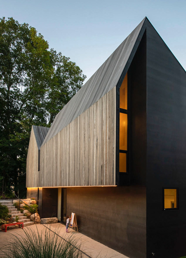
The site was a gully for stormwater. It was the path of least resistance for water to take from the road (the turnpike) down to the water (the pond). The immediate challenge was to identify a solution for this stormwater seasonally eroding the site. The next challenge was working on a parcel of land bookended by a busy Turnpike at one end and a densely vegetated pond on the other.
An old potato barn on Scuttlehole Road had many of the same challenges and advantages of Pike & Pond; sited on a busy road, faced with a steep slope, and with a view of a lush water body beyond. This structure revealed a solution incorporating qualities of both retention and privacy within a single design element: A retaining wall. As implemented on Pike & Pond, it does two things. First, it guides stormwater along the sides of the property. Second, it allows the main floor to be placed six feet below street level. This crucial siting decision allowed for a private forecourt defining the front entrance with a backyard and pond now made accessible down a landscaped flank to the rear. The swimming pool enclosed by vegetation and covered decks creates multi-seasonal outdoor spaces on the lowest level.
As one experiences it, an arriving vehicle cuts past a hedge of ten-foot-tall Junipers to park, unseen from the road, in a front yard designed for vehicular mobility. Upon getting out of the vehicle, one encounters the retaining wall, a dense bulwark of concrete and wood. After descending a few steps past this wall, the entry culminates in an intimate forecourt. One is now within the confines of the house proper. The entrance foyer and mudroom provide a further means to shed the world outside. The act of entering now complete, the house begins opening back up to the pond beyond. The pond now acts as the house’s main focal point, with views from almost every room.
For the material pallet, we experimented with using substrates as finish materials. The roof and the walls are a rain screen assembly of exposed rubber (roofing EPDM) and mahogany decking material. In this case, the sub straight, EPDM, is revealed in instances and slips behind the Mahogany shell where needed. The flooring is a poured self-leveling concrete, typically used as a substrate for tile. We used a baltic birch platform for the millwork and wall panels; this “platform” is the substrate upon which more expensive finish veneers get applied.
Oza Sabbeth Architects: Contractor: Modern Green Home. Engineer: Craft Engineering. Landscape: Oza Sabbeth Architects.

~~~~~~~~~~~~~~~~~~~~~~~~~~~~~~~~~~~
—————– Merit Award / Architecture —————–
Pond View House: Stelle Lomont Rouhani Architects
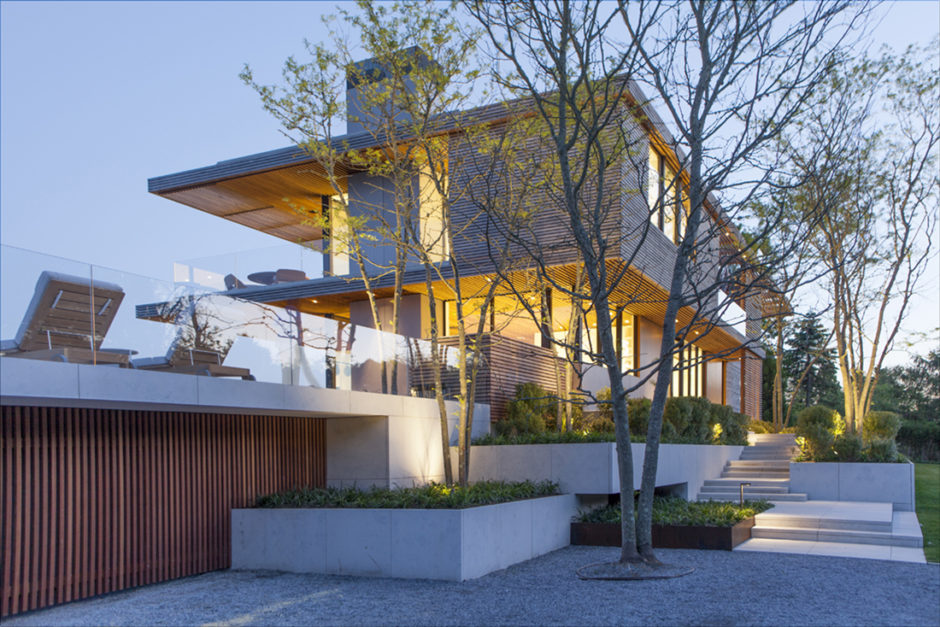
Located on the water’s edge of a narrow peninsula, this residence is oriented toward a coveted panoramic view of layered bay scenery and distant vistas of the Atlantic Ocean. The residence and pool pavilion were conceived as lightweight structures balanced upon an elevated plinth that converse with each other across a vanishing edge pool and terraces.
Approaching the property alongside a body of water and navigating a gravel driveway and louvered gate, the pool house accessory building gestures towards the parking court and house beyond. The podium runs the width of the narrow site to raise the ground floor above the floodplain and separates the initial space of arrival from the elevated activity spaces. An opaque slatted wood wall precludes views through the site to engender a sense of anticipation when moving across the property. Meandering masonry planters and steps ascend to the entrance where a framed view of the primary vista is revealed through the depth of the house. Thereafter, routes to distinct destinations that support the primary indoor and outdoor living spaces are navigable – including a pool house, a verdant path to a dock, and a roof deck with 360 degree water views.
The project’s planning and massing conceptually adopt characteristics of the ubiquitous vista from the site. Reminiscent of picturesque compositions, the sinuous shoreline recedes dramatically into a deep perspective. The foreground scenery is a narrow creek that feeds into a larger body of water beyond, and further into the distance the beach and the ocean form the horizon, inspiring design strategies – compressing spaces and focusing views prior to revealing the broader site context, providing diagonal views and meandering paths, and providing shifts in design axis in order to relax elements of the plan. Site conditions also inspired textural effects and material selections, and provoked a strategy of concealing and framing layers of foreground and background areas.
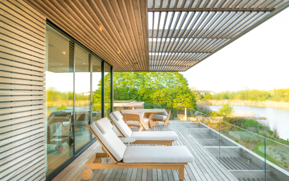
Despite the slender proportion of the site on which to organize the structures, the ambiances achieved are varied. A type of ordered complexity was sought among the spaces and circulation routes and their orientations toward the landscape. Walls of glazing that occasionally pocket away entirely provide an open and unobstructed relationship with the landscape between major interior spaces and patios. The textural character of the wood siding and rhythm of the ceiling battens moderate the pronounced articulations in building massing and screens, and trellises provide diffuse and animated light and shadow.
Limestone floors and mahogany ceilings are used both in interior and exterior spaces, visually extending the inside to the exterior. Interior finishes are generally restrained – detailed as a calm backdrop for the occupants and their possessions. A material palette of glass, anodized aluminum, mahogany, and stone are selected for their ability to gracefully age, and also durability. Measures to reduce the structure’s ecological footprint include a substantial solar panel array, an advanced insulation system, and native low-maintenance and drought-tolerant landscaping. Other sustainable features include roof sedum planting, multigenerational accessible design, high performance glazing, and louvered sunscreens.
Project Architect Michael Lomont / Architecture Team: Jonathan Walker, Toby Sherrard. Contractor: Seascape Partners; Landscape Architect: LaGuardia Design Landscape Architecture. Structural Engineer: Silman. Civil Engineer: P.W. Grosser Consulting. Interior Designer: Shawn Henderson. Photo: Marc Schwaer.

Stelle Lomont Rouhani Architects
~~~~~~~~~~~~~~~~~~~~~~~~~~~~~~~~~~~
—————– Merit Award / Architecture —————–
Brick Kiln: Oza Sabbeth Architects
Historic Preservation / Adaptive Re-Use
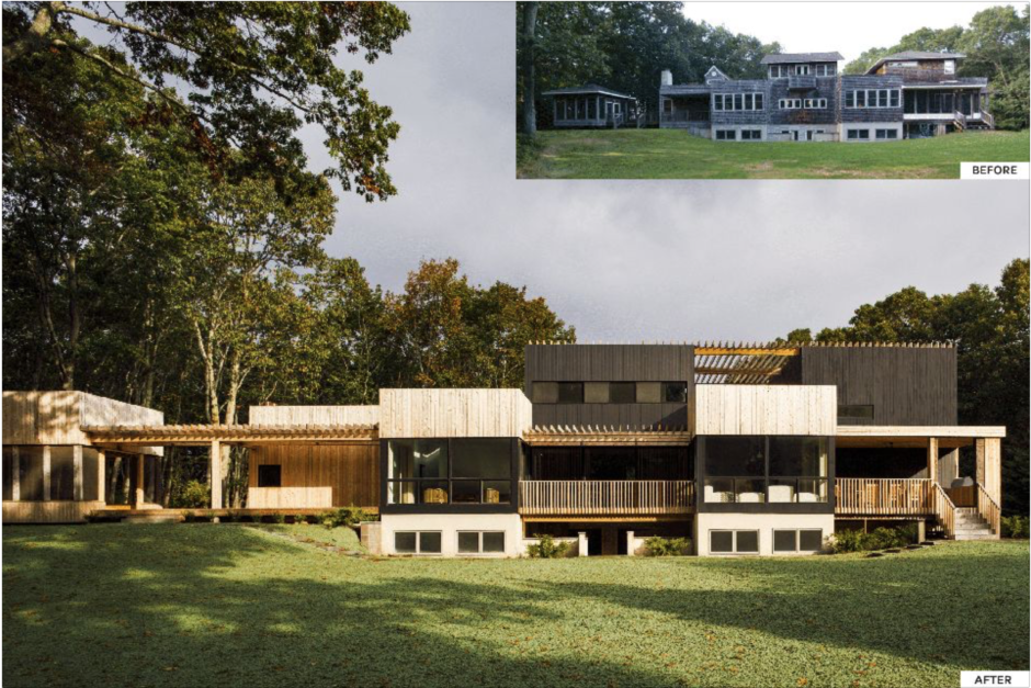
An Architect’s commitment to sustainability starts with the question of whether a structure can be reused. An ethos of renovating is a more sustainable approach to design than to continually demolish and rebuild. As design-build Architects, we renovate structures quite radically and are suited to this type of project’s risks and uncertainties. Renovating helps us see what has gone wrong with buildings over time and reveals opportunities not taken in a structure’s past lives. This in turn makes us better designers. For our clients, renovations tend to be a better value than tearing down and rebuilding where suitable.
Analysis and utilization of the existing bones of the Brick Kiln home was an essential way to begin its sustainable reimagination. The existing structure created natural divisions of space, with the most public spaces towards the entryway and increased privacy as you move farther into the home. By understanding the structural composition of the home, we were able to reduce the number of divisions inside the space and improve the circulation of the home. The opening of the plans allowed for increased connections horizontally and for the full length of the existing home to be finally realized.
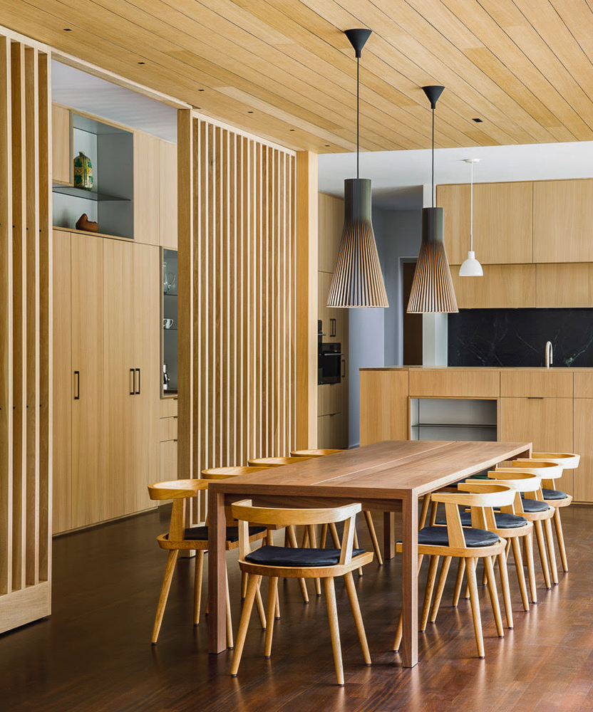
Not only were the plans of the home opened during the renovation, but the replacement of the existing sloped roof systems with pergola-like roofs opened the volumes of the home towards the sky to receive plenty of natural daylight. The wooden slatted planes created continuity in the facades by connecting the volumes of each level. The role of the Architect when designing an adaptive reuse project is not only reimagining the relationship of the client to the interior of their home and its structure, but also refreshing their relationship with the surrounding environment. Before the renovation of the Brick Kiln project, the home had a firm boundary between the exterior and interior spaces. After, the client is able to inhabit a larger spectrum of spaces, including shaded porch spaces and carefully placed pathways. The multiple punched-out windows are replaced by large sheets of glass and sliding doors–creating a datum of increased transparency and light. A crucial practice for the growth of the Architect and for the progress and betterment of Architecture as a whole is iterating on the structures of past Architects–utilizing the bones and the environment given to them and reimagining and reshaping it into something with new life. The renovation of the Brick Kiln home provided a new life for the building, a new experience of the site, and a bettered quality of life for the inhabitants.
Oza Sabbeth Architects. Contractor: Modern Green Home. Engineering: DiLandro Engineering. Landscape: Geoffrey Nimmer Landscapes

~~~~~~~~~~~~~~~~~~~~~~~~~~~~~~~~~~~
—————– Merit Award / Architecture —————–
Jobs Lane: Blaze Makoid Architecture
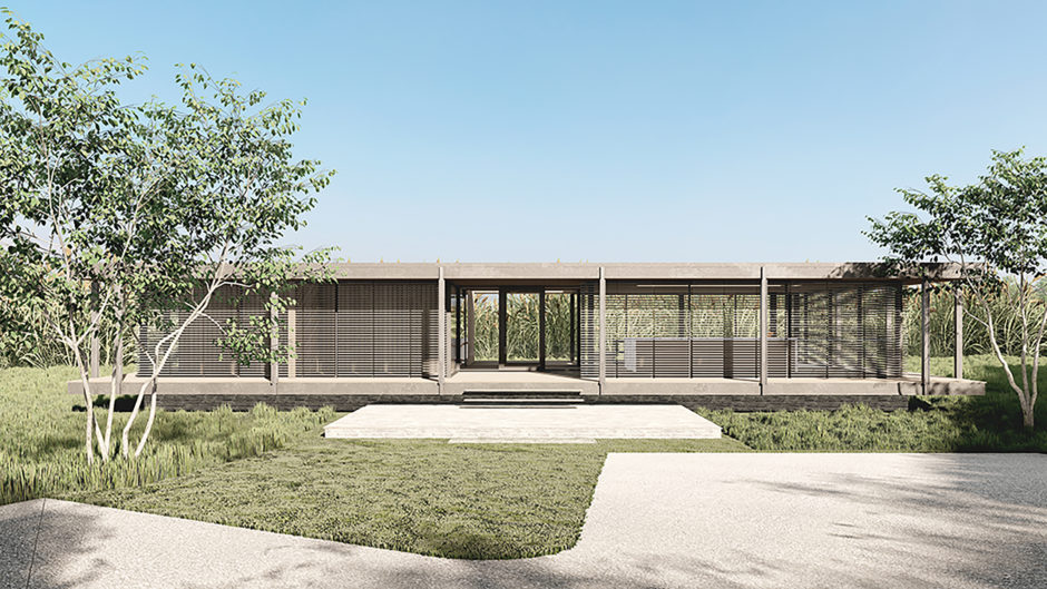
The Hamptons has a long history as an experimental playground for modern architecture. However, more often than not the old is replaced with the new. That is not the case for this humble modern masterpiece, designed by Peter Blake in 1960, conceived of as a study in the art of weekending – challenging conservative norms of lifestyle by encouraging its inhabitants to go one-on-one with nature herself. Although neglected over time and in need of substantial repair, the architectural significance of this single-story residence merited a respectful renovation rather than being discarded.
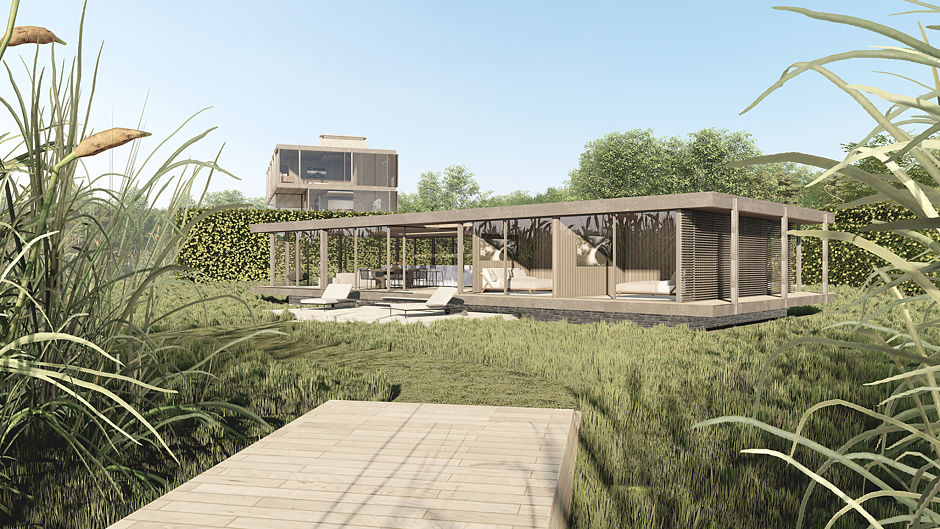
Originally designed as a summer house to be closed and vacated during winter, the proposed design endeavors to bring new life to this classic while allowing year-round use. The open-air breezeway, angled like the lens of a camera towards the most scenic part of the bay has been partially enclosed with a glass link, connecting the two halves of the house. This not only creates a point of entry but allows the user to travel comfortably through the spaces even in the coldest weather. At the same time sufficient covered outdoor space and the surrounding pencil-thin pilotis are maintained, honoring both the social intent as well as the signature detailing.
The proposed renovation of the public areas reorganizes the living, dining and kitchen functions into a single, larger entertaining zone while also increasing glazing toward the bay. The plan rethinks the original solid/void strategy of the exterior envelope from a pinwheel organization to one that emphasizes the unique view, while maintaining the opaque panels of the pinwheel plan. The four-bedroom, two bath plan is revised into a more current, two bedroom, two bath arrangement.
The residences’ location in close proximity to wetlands has been maintained and the single-story structure now floats atop a sea of native plantings connecting its inhabitants with the surrounding landscape. The proposed renovation continues to challenge the norms of modern lifestyle when considering a weekend utopia.

www.blazemakoid-architecture.com
~~~~~~~~~~~~~~~~~~~~~~~~~~~~~~~~~~~
—————– Merit Award / Emerging Architect —————–
Amagansett House: Sean Madigan AIA
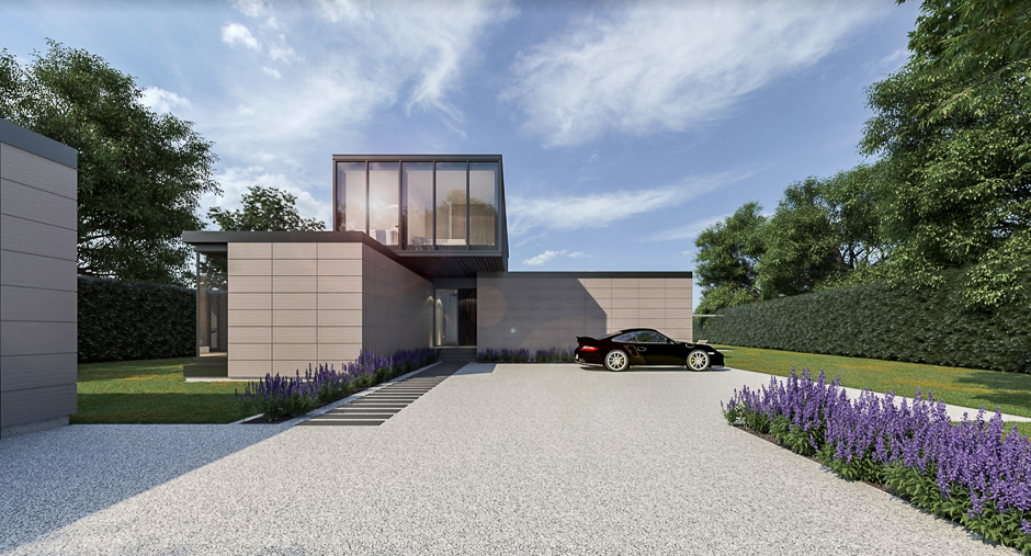
This project is located north of the highway in Amagansett. The site is just over an acre of previously cleared land situated in a neighborhood with similarly sized lots. The abnormally thin and deep lot proportion mandated that the short elevation was faced the street. Typical neighboring properties have a 2 story street-facing facade, however, in order to maintain a human scale relative to the narrow width, the massing needed to be stepped and staggered. This constraint drove an initial massing consisting of 4 rectangular volumes organized in a composition based on their programmatic requirements. Each volume contains a set program: the garage, the master suite, the main public spaces, and the 2nd floor private bedrooms. The volumes are spaced apart from one another to allow for natural circulation between rooms. To further emphasize each volume, exterior cladding materials continued as interior finishes.
The material pallette for the project recreates the surrounding bucolic landscape. The first floor volumes of the house are clad in terra cotta panels, whose cartesian organization sets up a geometric grid for the entire project to follow. The upper volume is clad in blackened cedar rainscreen planks. The warm color of the terra cotta echoes the color of the clay embankments of the nearby wetlands, and the dark colors of the wood and metal surrender the spotlight to the natural environment. Blackened steel trim and coping are used to articulate connections between materials. The vertical main stairwell and fireplace serve as anchoring elements and are constructed of cast in place reinforced concrete.
The project addresses the notion of time in various ways. Carefully selected window apertures orient the inhabitant to the changing time of day and seasons. Overhangs mitigate direct solar heat gain in summer months during high solar altitude, but allow low angle winter light inside the house. Another way the project addresses time is through its natural materials. Each material has texture and porosity, which is deliberately selected to visually illustrate weathering over time. By embracing weathering of the materials, each year that passes is carved onto the surface of the home, like rings of a tree. As the house ages, it becomes more and more mixed with the landscape, and establishes itself as something that belongs to, and is born of, its environment.

VISIT AAQ’S PREVIOUS AIA PECONIC DESIGN AWARD PORTFOLIOS
-
AIA Peconic: 2013 Daniel J. Rowen Memorial Design Awards
-
AIA Peconic: 2014 Daniel J. Rowen Memorial Design Awards
-
AIA Peconic: 2015 Daniel J. Rowen Memorial Design Awards
-
AIA Peconic: 2016 Daniel J. Rowen Memorial Design Awards
-
AIA Peconic: 2017 Daniel J. Rowen Memorial Design Awards
-
AIA Peconic: 2018 Daniel J. Rowen Memorial Design Awards
-
AIA Peconic: 2020 Daniel J. Rowen Memorial Design Awards
~~~~~~~~~~~~~~~~~~~~~~~

—————-

Images & Copy courtesy of AIA Peconic.
_______________________________________________________________________
