2016 Daniel J. Rowen Memorial Design Awards
~~~~~~~~~~~~~~~~~~~~~~~~~~~~~~~~~
Honor Award / Historic Preservation / Adaptive Reuse
SchappacherWhite Architecture
Project: Wm. Farmer & Sons Boarding & Barroom
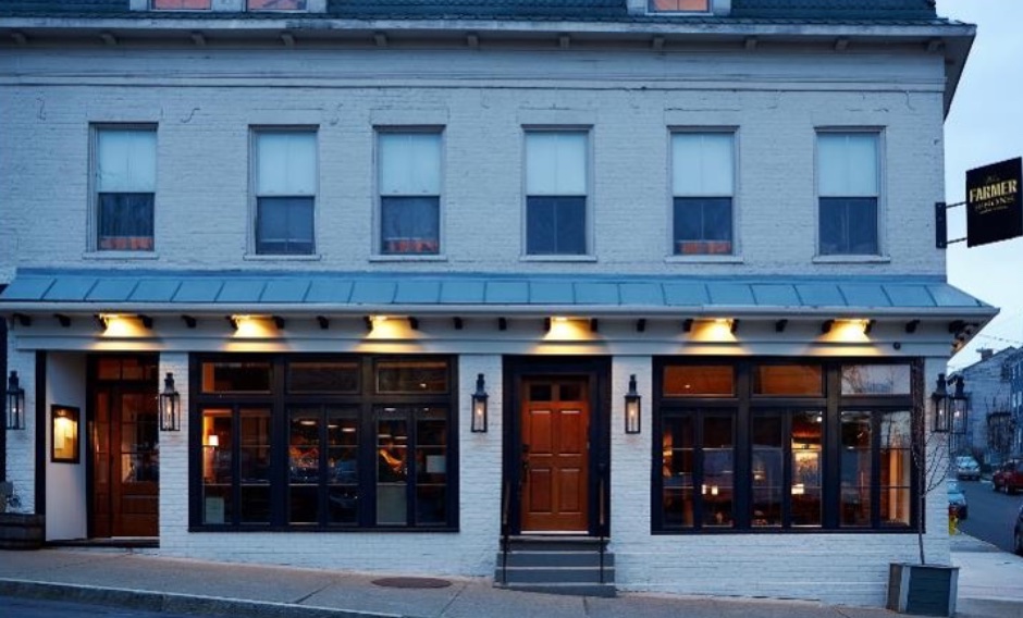
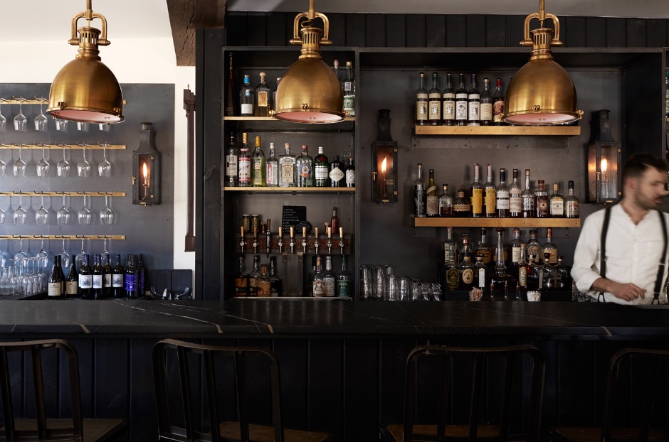
 Nearly two centuries old, the historic structures housing Wm. Farmer & Sons in Hudson, New York, were a strong inspiration for the design of the restaurant and bar’s aesthetic. Wm. Farmer & Sons is a new farm-to-table restaurant from husband-and-wife team William “Kirby” Farmer, the chef (and son of “Wm”), and creative partner Kristan Keck.
The Clients had already settled on turning three buildings dating from the 1830s into one new structure to serve as their new restaurant/bar, mercantile, and boarding house when they contacted the architectural firm. The first floor level below the boarding house remained vacant prior to a full-scale renovation.
They had discovered the work of this firm earlier and had “instantly fallen in love with their style and approach.” Meeting over previous years led to an informality that explored creativity. At one point during the design process, a meeting occurred at the architect’s home where goals and the design were discussed, and then everyone sat down to a dinner prepared by the chef, Kirby. The team benefited from an open-mindedness about the end result. It was a process, with input by all trades, the owners and the architects. The drawings were not 100 percent completed in advance, everyone allowed flexibility in ideas and results with a lot of hand sketches on site.
The challenges of renovating nearly 200-year-old buildings were vast. As noted by the Client, “There is not a square angle in the entire place and the building sits on a corner that slopes downward on both sides.” The general contractor’s determination of ‘level’ was a mental equation that all partners worked together to achieve. If anything was built using an actual level, it would appear terribly crooked.
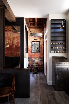
New windows and doors were added to the facade, some relocated, others enlarged to sizes found in historical photos, the full facade repaired and repainted, and new gas lanterns installed. All approved by the Historical Board. Inside, some of the structure’s original details are in intact, including original joists and flooring in the mercantile, and the preserved brick and stone party wall in the bar. Since the materials were sourced from so many different periods, the team decided to avoid color and let the myriad textures balance themselves. From the start, it was determined that texture would be used as opposed to color, and using all-natural elements for depth.
The architects wanted to keep the original heavy timber ceiling beams, but they were no longer structurally sound from many modifications over time. The team spent months searching for an old barn with similar beams. The replacement beams are supported by vertical steel I-beams that were just beginning to rust at the steel yard, which they collected as-is for the patina.
The architects found that there is a love of craft and the handmade in Hudson. The chef, Kirby, forms relations with local farmers for his food sources, and the architects did the same with local sources for materials and construction.
Credits & Contact Information listed at end of Album.
===============================================================
Honor Award / Architecture
Roger Ferris & Partners
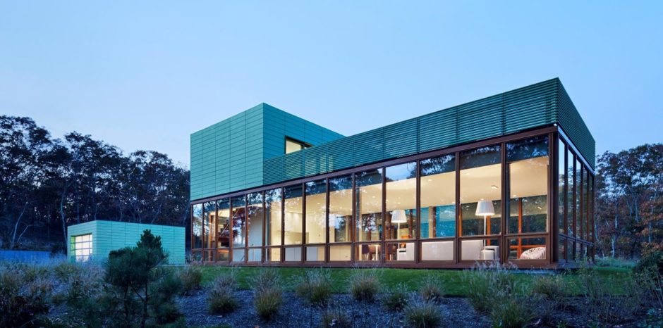
Project: Green House
===============================================================
Merit Award / Architecture
Bates & Masi Architects LLC
Project: Underhill
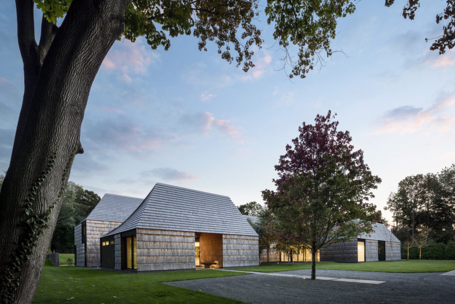
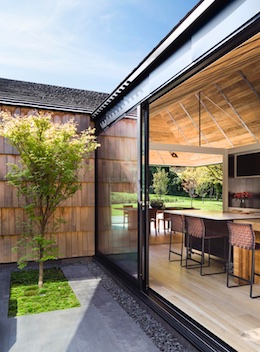
Socially and professionally a couple desired to live in an urban environment. However, living in the city didn’t afford the lifestyle they wanted for their children as they approached school age. To compromise between remaining close to the city while raising their family, they relocated to the suburbs. Their goal was to create a strong sense of place in an environment with close neighbors on all sides of their property. The history of the community they chose, an early Quaker settlement, inspired the solution. Based on the Quaker tenants of simplicity, humility, and inner focus, the house is broken into a series of modest gabled structures, each one focused inward on its own garden courtyard instead of out to the surrounding neighbors.
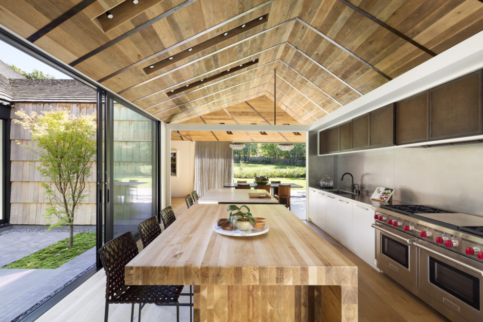
The simplicity of each courtyard distills the experience of nature, encouraging one to appreciate its subtleties. Every interior space is connected to the exterior on two sides. The layering of spaces from exterior to interior to courtyard collapses the boundaries between them. From selected vantage points, one may see across multiple spaces and courtyards to framed views beyond. Each volume has a sculpted roof that funnels light and air into the center of the structure.
The detailing of materials accentuates the central courtyard. The oak floor and weathered oak ceiling boards both radiate outwards from the center. The floor and ceiling boards are custom cut in width and mitered to trace continuously and concentrically around the courtyard. Weathered metal straps on the ceiling further emphasize this geometry and act as a device to organize lighting and audiovisual equipment throughout the house.
The idea of the pavilion is evident through several moves in the landscape. The building’s inverse form is carved out of the earth to create a lower courtyard at the basement level. Planted retaining walls slope down to let light and air into the lower level. Similarly, a sloped, depressed area forms a destination in the landscape, where a grove of trees grows, creating a contemplative spot much like the interior courtyards.
The shingle coursing and pitched roofs reference the early Quaker settlement buildings in the area. A limited number of materials are carefully detailed to accentuate the geometric form of each pavilion. A pronounced shadow line traces around each building and articulates the scale of the oversized shingles and undercoursing layer. On the roof, the shingles are an ideal material as they accommodate tapering courses that follow the roofs compound pitches. At areas below grade bluestone is cut to the same size and shape and applied in a shingled manner on the chimney to retain the uniformity of the volumes.
The Quaker values of simplicity and craft tie the new home to the community. Using the courtyard as a device to bring light and nature into the interior of each volume results in an inward looking and contemplative home that appeases the parents practical concerns and creates a desirable environment for the children’s upbringing.
Credits & Contact Information listed at end of Album.
===============================================================
Merit Award / Architecture
Stelle Lomont Rouhani Architects
Project: Mako
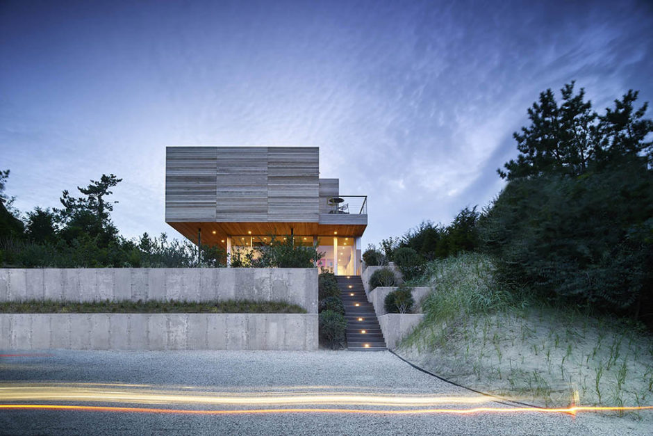
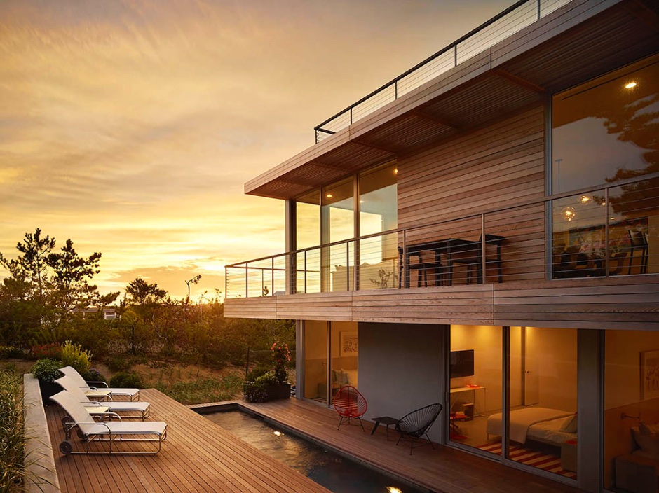
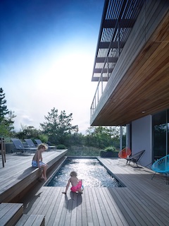 This 2500 sf structure was designed for a multi-generational family. The lot that the house sits on is fairly restricted, not only because of it’s dramatic vertical climb, but also because of the beautiful natural dune that we wished to preserve. The location of the dune informed the location of the house and the pool. The second floor cantilever allows for a smaller footprint on the lower floor and as a result, more open space around the building on the ground floor. This is an upside down house. The entry stairs lead up to the glassed in entry stair, which leads up to the main living, dining, and kitchen area. The master bedroom is also on this floor, taking advantage of the ocean views. The lower level is made up of the entry, and a series of poolside bedrooms, all with individual access out to the pool and deck. Although the house is small, there are a variety of spaces and activities, to fulfill the needs of a multi-generational family. The roof is all deck, providing additional entertainment space and opportunity to enjoy the sun.
Structurally, the goal was to design the building using as little steel as possible. It is mostly a wood frame building with some specialized connections. Most of the steel occurs in the cantilever of the wood sunscreen at roof level, and the deck. It also includes the posts that carry the overhang of the master bedroom above.
Credits & Contact Information listed at end of Album.
===============================================================
Merit Award / Architecture
Stelle Lomont Rouhani Architects
Project: Fairfield
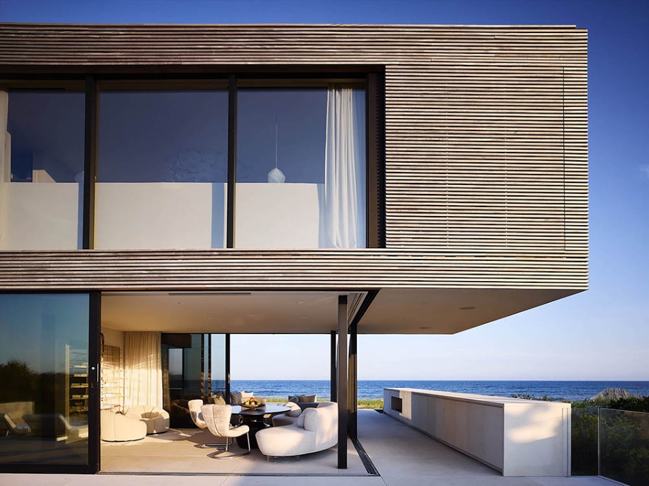
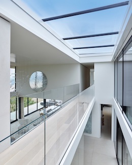
Perched between ocean and pond, Fairfield house almost appears to allow the landscape to run through it. Acting as both an extension of its surroundings and as a shelter from it, the house is conceived with flooding and wind in mind. Fairfield is constructed on piles and is comprised of a steel frame clad in durable mahogany, with anodized aluminum framed windows and doors, and high density limestone. These are all recyclable materials intentionally chosen for their low maintenance in this harsh but beautiful setting. The lower level opens up to the limestone clad pool on the pond side, and to dune grass and ocean to the south. Overhangs and operable screens limit heat gain during summer months, but allow for the warmer rays to penetrate through in winter. Less than 5 thousand square feet, the house offers a myriad of ways to experience the setting, from the second stair bridge in the double height entry and living room to lower level rooms that open up completely to become covered outdoor porches. A robust revegetation program allows the building to become an extension of the natural landscape that it inhabits.
The house is approached through a loosely terraced set of stairs, bypassing the elevated pool, which at the entry level functions as a water element allowing the sound of water running over the edge to signify the arrival. Yet once up at the main level entrance, the pool and surrounding decks are screened through vegetation and low walls, providing the area privacy and the uninterrupted view out to the pond beyond. The moment of arrival at the entry takes you straight through the main space and out to the ocean ahead. Once inside, pending the space, there is either oceanfront, or pond views, with some spaces acting as an open bridge between both. The lower level is composed of a main living room open to an offset dining area both ocean facing. The separated kitchen opens up to the pool terrace and pond view, literally with a large sliding window that allows for an old school concession counter relationship between kitchen and terrace. Adjoining the kitchen is a glassed in eating area enclosed by retracting glass doors. Throughout the lower level, limestone walls function to contain, guide, and define various areas. On the ocean front terrace the wall becomes a container, housing a gas fireplace and various cabinetry for outdoor entertaining.
The east wing of the house functions as guest and family bedrooms on both floors. Conservative in size, each forges a relationship with the exterior through floor to ceiling glass, properly screened, again to avoid heat gain as much as possible. Each has its own ensuite bathroom. The second floor bridge connects the children’s’ bedrooms to the master suite and a sitting room with a glass corner.
The interior palette matches the exterior, with the limestone extending throughout the main level and reappearing as solid blocks in bathrooms. Light colored oak flooring is found on the second floor. The master bath with sunset views is entirely clad in a subtle stone. The intention throughout is to reinforce rather than detract from the natural beauty of the surroundings.
Credits & Contact Information listed at end of Album.
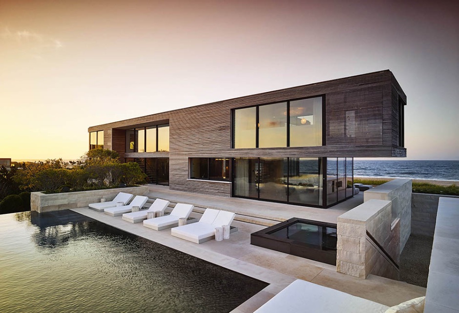
===============================================================
Merit Award / Historic Preservation / Adaptive Reuse
LuPe Design
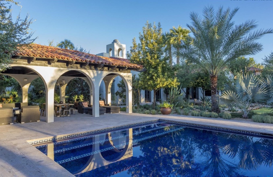
Project: Casa Encantada
===============================================================
Merit Award / Historic Preservation / Adaptive Reuse
Oza / Sabbeth Architecture
Project: The Sea Barn
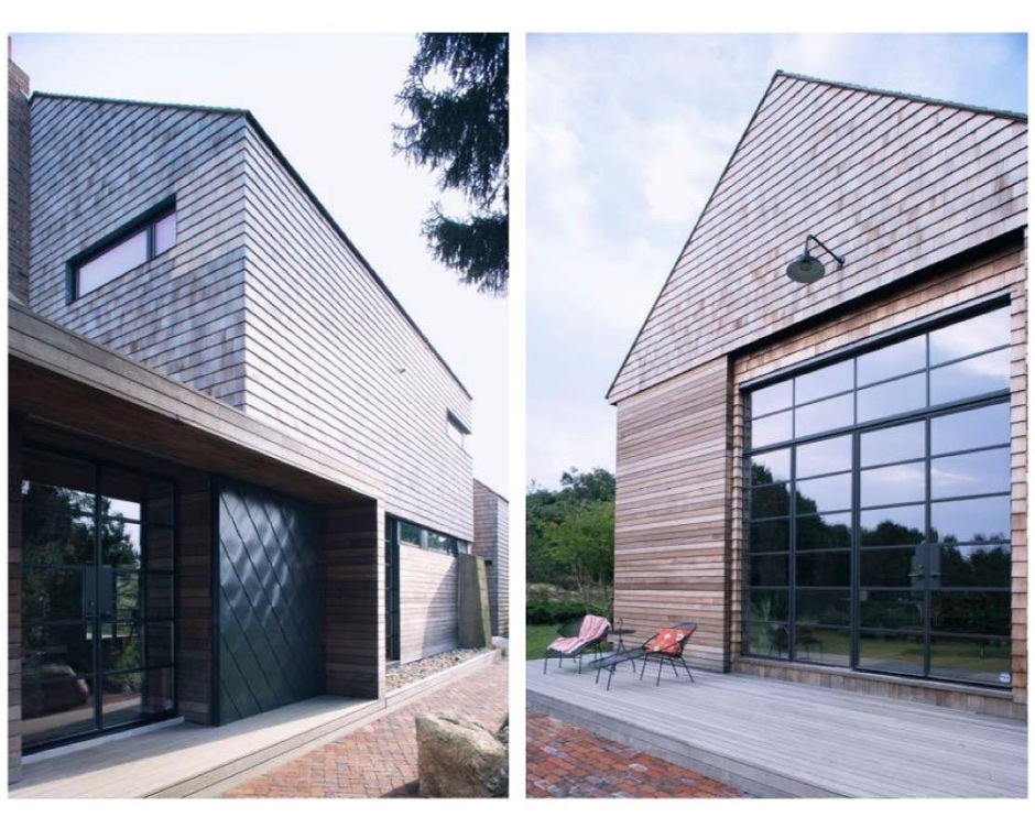
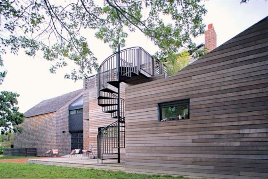
 In 1938 this part of the South Fork was devastated by a Hurricane. Following this event many structures were rebuilt on rm foundations. This property, located conveniently between the Ocean and the main thoroughfare, was mined for sand and gravel. The original structure probably housed equipment and serviced this operation in other ways but over the years it has been added to and repurposed as a dwelling. It was abandoned and slated for demolition when we were approached to work on it.
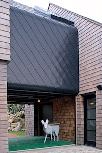
We advised the clients to keep the structure and work with it. While it was clear that there were two Barn Structures from the outset, selective demolition revealed that the two were connected together by a structurally redundant assembly. This was removed to create a breezeway. A ‘mini-barn’, clad in metal shingles, is now suspended within this gap. Twin garage doors below can be held open to allow access to a rock embankment in the backyard or closed to create a heated vestibule connecting the two Barns; One of which functions as an Art Studio and the other a loft three bedroom apartment for the family.
Credits & Contact Information listed at end of Album.
===============================================================
Merit Award / Unbuilt Project
CCY Architects
Project: Bay to Beach House
===============================================================
Jurors’ Award / Unbuilt Project
Maziar Behrooz Architecture
Project: Chelsea Art Storage & Museum
Art Box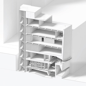
An Art Storage and Museum Building in Chelsea
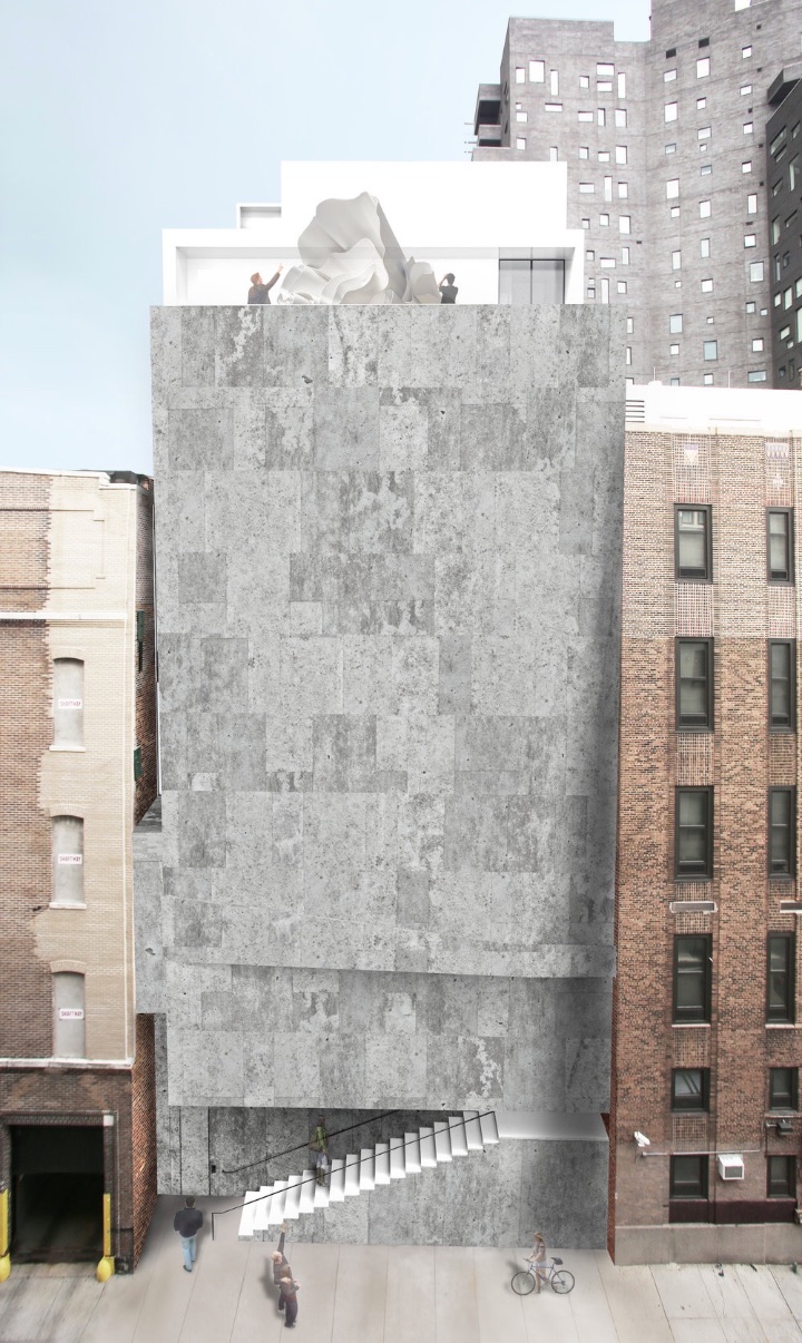
An urban lot on a side street in Chelsea is the site of an art storage and display facility.
The need for this building type became evident to us as we began to design spaces for art collections of our clients. During our research, we visited a few art-storage facilities that house un-advertised but potentially significant collections of art. Such facilities made us wonder, what may be contained in them? And how wonderful it would be for the public to be able to see curated shows that cross-reference art-work between various private collections.
Working on a 50’ wide by 90’ deep lot, zoned C.6, close to the ‘Highline’, we explored the multiple design facets of such a building and the issues that straddle the boundary between private art collection and public art viewing.
The project studies the nuanced and often challenging needs of storage of significant works of art and the delicate but rewarding benefit of publicly displaying both the ‘art of storage’ and the stored art. As such, the storage components of the building are visibly integrated on each floor with gallery or display spaces. In particular, immediately upon entering the building at the top of the rotated ‘stoop’, the museum-goer will see a compact storage area, through secure glass. On upper levels, the boundary between the storage areas and the gallery areas can be both adjusted and manipulated to serve fluid programs and intents. The work of art is always in close and visible proximity to where its stored.
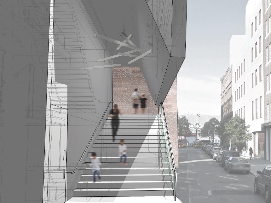
Urbanistically, the building makes accommodations to its street and neighborhood. Its facade is both slightly rotated away from the front property line, and slightly tilted down, creating a sliver of space that draws one in and transitions into a rotated ‘stoop’. Upon entering the staircase, one notices its high vaulted ceiling: the staircase becomes a public space and a place of public activity. Ascending it, one slowly disconnects from the noisy urban realm to the quiet within. Right before entering, only ones feet are visible from the street.
Navigating into the building, the first three floors are open to the public and connected with a staircase and passenger elevator. The top of this public stair terminates with a coffee shop, a place to sit and view street activity, and semi-public office spaces. The basement and ground floor, no longer able to contain mechanical equipment due to hurricane Sandy, are now given to a publicly accessible auditorium. Both passenger and freight elevators are accessed separately and securely from the ground level, on either side of the auditorium.
Typical rectangular introverted ‘white-box’ gallery spaces are punctuated with slivered openings that infuse the rooms with filtered natural light and allow glimpses of the architecture of the neighborhood. The elevators in the rear are similarly bordered with windows that both frame ones location within the block and allow natural light to be brought in.
The building facade, ground level, and front public areas are made of raw, roughly finished, poured-in-place concrete.
The overlap of particular socio-economic tides — the rise of a shared economy that harnesses unattended markets, the proliferation of art collections, the lack of sufficient spaces of public and communal activity, and the general democratization of art-viewing — has foster an environment wherein our proposal, we hope, is necessary and timely.
Credits & Contact Information listed at end of Album.
~~~~~~~~~~~~~~~~~~~~~~~~~~~~~~~~
AIA Peconic 2016 Architecture Awards Jurors
Willy Zambrano, AIA from Zambrano Architectural Design LLC, Michael Wetstone AIA LEED AP from Beyer Blinder Belle Architects & Planners and Frank Fusaro AIA from Handel Architects LLP reviewed the projects and presented awards that recognized unbuilt architecture, planning, urban design and research.
~~~~~~~~~~~~~~~~~~~~~~~~~~~~~~~~~~~~~~~~~~~~~~~
ARCHITECTS — CONTACT INFORMATION — CREDITS
Honor Award / Architecture / Historic Preservation / Adaptive Reuse
SchappacherWhite Architecture
Project: Wm. Farmer & Sons Boarding & Barroom, Hudson, New York
Architect: SchappacherWhite Architecture DPC. Photographer: Jason Lindberg
www.schappacherwhite.com
————————————————————————-
Merit Award / Architecture
Bates & Masi Architects LLC
Project: Underhill, Matinecock, New York
Architect: Bates Masi + Architects. Photographer: Michael Moran/OTTO

www.batesmasi.com
————————————————————————-
Merit Award / Architecture
Stelle Lomont Rouhani Architects
Project: Mako, Amagansett
Design Team: Viola Rouhani, Jonathan Subject, John Whelan, Interiors by Eleanor Donnelly, Stelle Lomont Rouhani Architects. Photographer: Matthew Carbone. Contractor: M.A.P. Andrew Anderson.
www.stelleco.com
————————————————————————-
Merit Award / Architecture
Stelle Lomont Rouhani Architects
Project: Fairfield, Sagaponack
Architect: Stelle Lomont Rouhani Architects / Design Team: Viola Rouhani, Lucas Cowart. Photographer: Matthew Carbone. Contractor: Seascape Partners. Landscape Architect: Laguardia Design Group. Interior Design: Julie Hillman Design. Engineer: Silman Structural Engineer.

www.stelleco.com
————————————————————————-
Merit Award / Historic Preservation / Adaptive Reuse
Oza / Sabbeth Architecture
Project: The Sea Barn
Architect: Nilay Oza AIA, 2408 Montauk Highway #2A. Contractor: Saldana Builders LLC | PO Box 716 Sag Harbor, NY.

www.ozasabbeth.com
————————————————————————-
Jurors’ Award / Unbuilt Project
Maziar Behrooz Architecture
Project: Chelsea Art Storage & Museum
Maziar Behrooz, Renee Rust, Hao-Tian Xu, Brandon Ma, Jee Won Kim.
www.mbarchitecture.com
~~~~~~~~~~~~~~~~~~~~~~~~~~~~~~~~~~~~~~~~~~~~~~~~~~~~~~~~
www.aiapeconic.org
———————————–
Visit: AAQ Portfolio / Architecture
AIA Peconic: 2013 Daniel J. Rowen Memorial Design Awards
AIA Peconic: 2014 Daniel J. Rowen Memorial Design Awards
AIA Peconic: 2015 Daniel J. Rowen Memorial Design Awards
~~~~~~~~~~~~~~~~~~~~~~~~~~~~~~~~~~~~~~~~~~~~~~~~~~~~~~~~~~~~~

