
AIA Peconic Daniel J. Rowen Design Awards / 2017
============================================
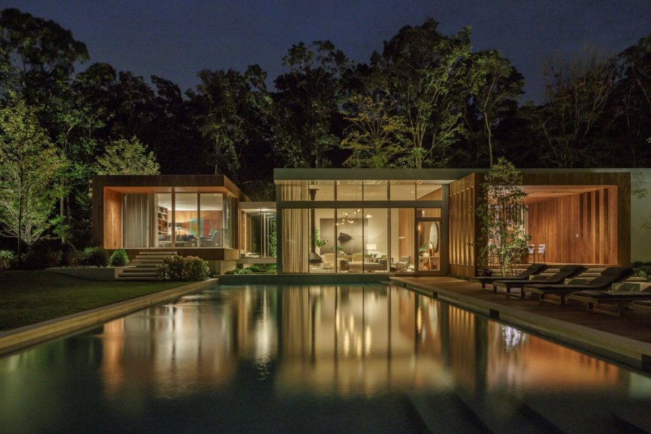
Honor Award: Old Orchard / Architecture — Blaze Makoid Architecture
The owner of this two-acre property spent a year living in the 4,500 square foot modern spec-house to better understand how he would like to develop the project for himself.
The original structure was configured as a linear, single story, glass and metal box with grade carved down to basement level at both ends. This provided below-grade access to a garage at one end and a small courtyard for two lower level bedrooms at the other.
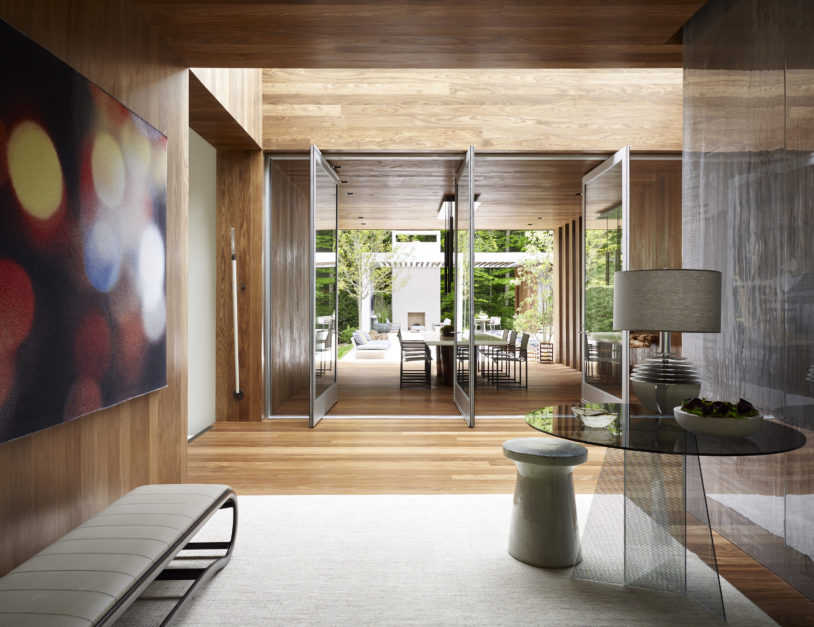
The intervention addresses a series of programmatic issues with architectural moments that clearly read as their own ‘family’. The language of simple wood and glass elements offers a recognizable contrast to the aluminum skin of the existing building and begins to warm the material palette.
The first wood ‘tube’ bisects the main structure, creating an entry plinth a few steps above the existing floor and setting up a visual alignment with a new pool house structure across the property. The second and third elements occur at either end of the existing structure, separated by small glass bridges. The new home office spans and helps to screen the not so inviting sunken garage drive, providing a more inviting, wood façade during approach. The two story master suite at the opposite end consists of a wood and glass bedroom and bath at grade level sitting atop a concrete, basement level plinth containing a substantial dressing room that opens up to the sunken courtyard.
Project Team Credits Below.
============================================
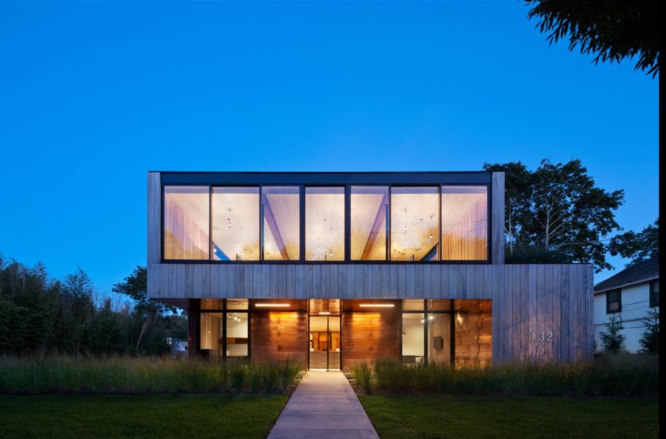
Honor Award: North Main / Architecture — Bates Masi + Architects LLC
Many contemporary commercial structures are planned with inherent disposability, minimizing initial cost at the expense of fortitude and long-term usefulness. This owner-occupied project challenges the conventional approach, enhancing the property’s value with durable material systems, flexible infrastructure, and adaptable spatial organization.
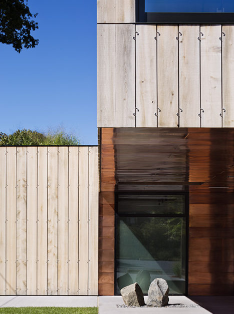
Based on vernacular building traditions, simple forms and naturally weather-resistant materials are employed instead of complex geometries, high-tech coatings, or materials that are at odds with the environment, both in the aesthetic sense of standing out among neighboring buildings and in the ecological sense of their toxicity. Copper shingles will show the effects of weathering but not succumb to them for at least 100 years. Similarly, the rainscreen siding of cedar planks will patina but endure, its longevity increased by an innovative fastening method of custom stainless steel clips. The clips grip the edges of each board instead of penetrating it with fasteners. Allowed to expand and contract and free of penetrations, the typical first point of failure, the boards will outlast typical cedar siding. In the same way that a car’s tires are prolonged by rotation, with the clip system the boards can be transferred from severe- to moderate- weathering facades and individually flipped front-to-back, further increasing their lifespan. A garden of beach grass insulates and protects the roof from sun and weather. Planted in modular trays, individual portions of the green roof can be removed for maintenance or to add future technologies such as photovoltaics.
Future technological developments are accounted for inside as well. Reflecting the siding, interior walls are clad by the same system of boards and clips. The boards can be easily removed and replaced, providing access to continuous chases that contain the power distribution, phone, and data cabling, as well as hvac ductwork. Electrical and hvac outlets can be moved, wireless transmitters hidden, and data cables upgraded with minimal disturbance. Additionally, the wood screens serve an acoustic purpose, the spaces between them admitting and trapping sound to prevent echoes in the large open spaces. The open-plan interior also provides for changing spatial needs. The hybrid steel and engineered wood structure allow for unencumbered, airy, daylit spaces that can be easily reconfigured. Even the overhead lighting in these open spaces provides for adaptation. Decorative globes hang from their cords on a grid of the siding clips. Light fixtures can be moved among the various clips depending on different furniture layouts.
In addition to enhancing the building’s value, the qualities of durability and flexibility lay the foundation for its sustainability. Unlike many “green” buildings, this project attends to basic construction elements instead of relying on auxiliary technologies to make it sustainable. By simplifying the structure’s configuration, minimizing building technologies, and facilitating future adaptation, the project attains “timelessness”; it will outlast its contemporaries and extend our natural resources.
Project Team Credits Below.
============================================
Merit Award: Mid-Century Modern Revived / Historical Preservation — Austin Patterson Disston Architects
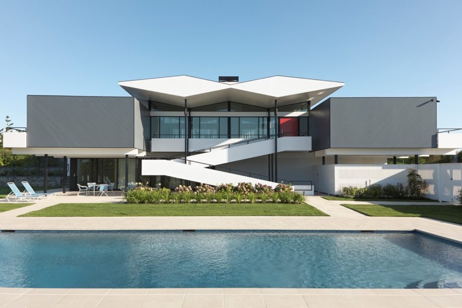
Set on the tallest dune (30 feet) in Quogue and overlooking both the Atlantic Ocean and Quantuck Bay, this restored mid-century modern house was originally designed in the early 1960s by architect Abraham Geller. The design is rooted in abstract expressionism which reduced building lines to well-defined shapes and surfaces to simple textures and colors. The 3,830 square-foot house evokes artist Piet Mondrian’s grid of black lines and primary colors as well as Swiss architect Le Corbusier’s exuberant 1930s/40s butterfly roof design. Each section of the double-diamond façade includes a triangular portion pointing down which creates a central butterfly roof effect on the exterior and high ceilings and large water view windows on the inside. The butterfly-shaped roof structure cantilevers out over the front entry ramp which serves as the only access between the two stories of the building. The large windows and vaulted ceiling let in natural light, creating an expansive central living room/dining room.
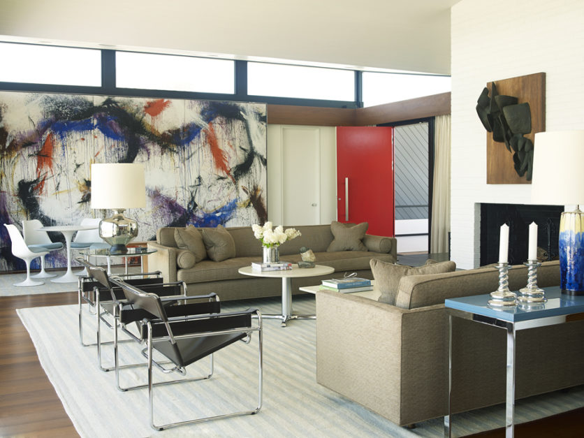
Though in disrepair, the house benefited from only one owner so that all custom elements remained intact. Our client was smitten by the house, spending a number of years negotiating with the trust officers for the then 92-year-old owner. He was at last able to purchase the house in 2012 and came to us with the desire to restore not only the house and its grounds but all custom-made furniture and period items that were included in the purchase. The owner’s estate included numerous original items in the transaction: the large living room painting by abstract expressionist Norman Bluhm, inside and outside mid-century furnishings, fireplace sculpture and accessories (lamps, vases, books).
There are minimal actual additions to the house and these include a second floor sitting room with ocean views which originally served as a guest bedroom. An existing ground level cabana was modified to become a guest bedroom suite with attached living spaces used as an accessory component to the pool area. A new outdoor shower is set next to the walkway to the beach, named Devil’s Dune for its height. Preserving the original aesthetic and design intent of the house was essential, as most of the exterior and interior detailing was replaced.
“The house as well as its contents was meticulously restored,” notes architect Stuart Disston, AIA, who spearheaded the project along with project manager Joshua Rosensweig. “With this thorough renovation and restoration, the house is posed to retain its work-of-art status well into this century.”
Project Team Credits Below.
============================================
Merit Award: Georgica Cove / Architecture — Bates Masi + Architects LLC
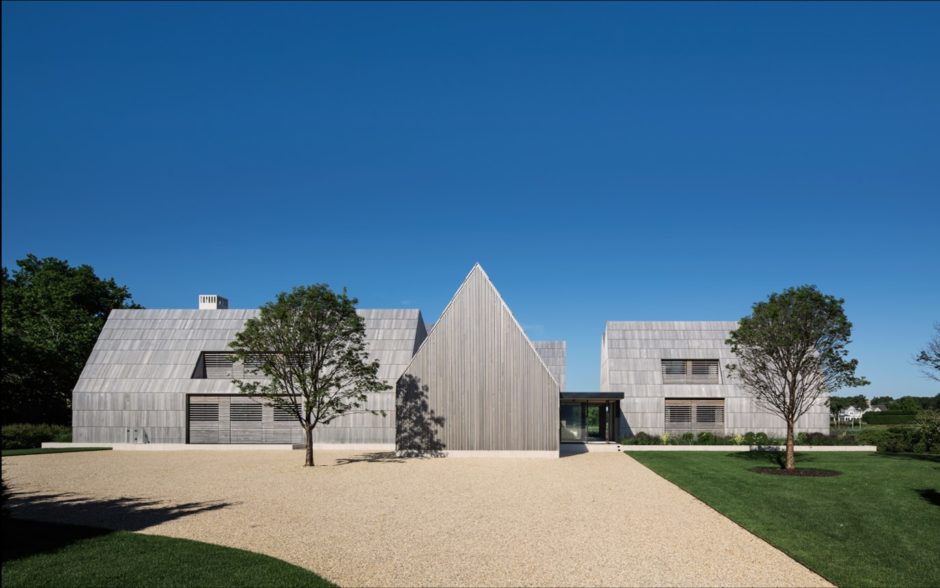
A couple with property on a cove overlooking the ocean asked for a house that would be comfortable for just the two of them the majority of the time. However, with their love of entertaining, the house had to grow on busy weekends to accommodate their children, grandchildren, and guests. To instill the desired sense of comfort and peace, it was also important that the design blend with the pastoral setting and vernacular building traditions: predominantly shingle style homes and barns that are often built and added to over time. Historic precedent studies revealed that referencing New England connected farms in an innovative way could achieve both goals.
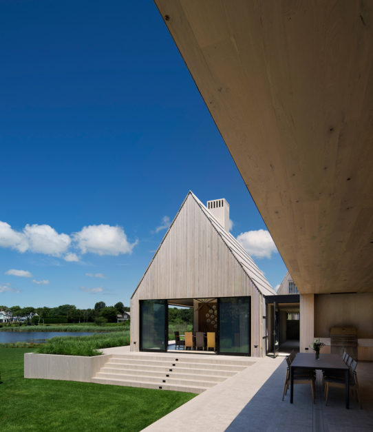
Connected farms aggregated over time, interconnecting multiple buildings with distinct uses. The architectural style of the house was applied to subsequent buildings to unify the assembly, but partitions within provided the necessary separation between uses: house to kitchen, kitchen to shop, and shop to barn for instance. One volume was often offset or rotated from the next to provide greater access to light, air, and privacy from the other functions. Following that example, the program of this house is divided into owners’ bedroom and office, eat-in kitchen and family room, formal living and dining, and guest rooms. The spaces are arranged around a courtyard to create visual and physical connections between them but those connections can be broken by large sliding doors. Each structure has an independent mechanical system allowing it to be shut down when unoccupied. This allows the livability of the house to expand and contract whether the couple is alone, hosting dinner guests, or has a full house of overnight guests.
As with connected farms, a limited palette of materials and details unifies the various spaces and responds to the local climate. The cedar shingles common to local buildings are scaled up to the size of boards to cover the roof and sidewalls. Cedar screens provide privacy and filter light. A limestone plinth filled with sand elevates the house above the flood plain while also creating drywells to accept storm water runoff. Oak floors and millwork throughout unify the spaces.
The design repurposes the historic typology of the connected farm to suit the very timely needs of the site and the family. By acknowledging the area’s history and tradition of building, this home is an evolution of its cultural expression.
Project Team Credits Below.
============================================
Merit Award: Atlantic Architecture — Bates Masi + Architects LLC
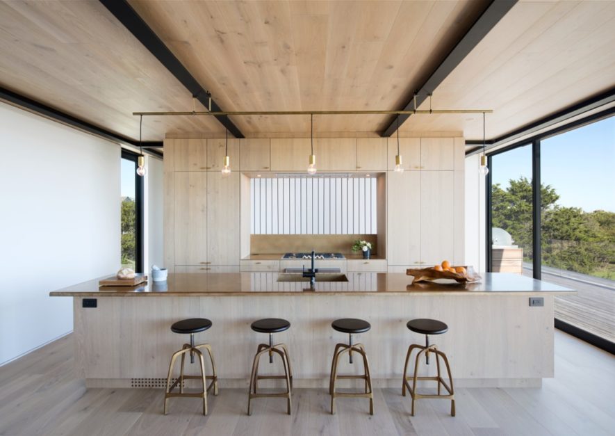
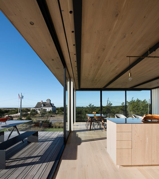
Across the street from the property, in the low dunes near the Atlantic Ocean, a historic Life Saving Station serves as a cherished reminder of the maritime, military and architectural history of this coastal landscape. Built over a century ago, the station is part of a network of structures used to provide rescue and relief for shipwrecked sailors, and it was from this station that a guard once discovered Nazi invaders coming ashore during World War II. Designed with lookout towers, weather-protected cupolas and elevated decks, the stations offered many views for the crews to survey the horizon through all seasons. Inside, large, open storage rooms often featured boats, oars and other useful items hung from exposed beams for easy access. Taking cues from this structure, the design of the new residence strikes a dialogue with the landmark to enrich the experience of the new home and celebrate the local history.
The principal strategy for the home stems from the utilitarian practice of hanging boats and other items from the station’s wooden post and beam structure. In a modern reinterpretation, the residence features an exposed steel structure which defines the main living spaces and forms a framework onto which other functions can be hung: the main stair is strung from beams above, and the rods used to support each tread serve as guardrail for the stair; a wood burning stove sits on a suspended steel shelf; light fixtures are fastened to the flanges using standard beam clamps; a swinging chair hangs from the cantilevered living area above.
On the exterior, a system of bronze bars was developed to hang the thick cedar siding boards in place without fastening through the wood, allowing the boards to expand and contract naturally with changes of temperature and humidity. Like the weathered cedar shingles on the Station across the street, each material—cedar, bronze, and weathering steel—was chosen for its proven durability in the coastal climate. As each material weathers over time, the appearance of the siding will record the cycles of rain, sun, freeze and thaw: cedar will lighten from the sun; bronze bars will patina to dark brown and eventually turn green; weathering steel will develop a deep rusted texture on the surface which protects it from further corrosion by the salty air. The weathering steel around the base of the building marks the height the home was raised above the flood plane. To minimize the impact of the footprint on the sensitive ecological environment, the main living area is stacked above the bedrooms, and, like the lookout towers of the stations, an even higher roof deck provides elevated views of the ocean.
By taking cues from the historic lifesaving station, the home responds to the environmental and historical context. In so doing, it honors the local heritage and enriches the present day experience.
Project Team Credits Below.
============================================
Juror Award: Guest House / Architecture — Roger Ferris and Partners
============================================
Juror Award: Black House / Adaptive Reuse — Oza / Sabbeth Architecture
============================================
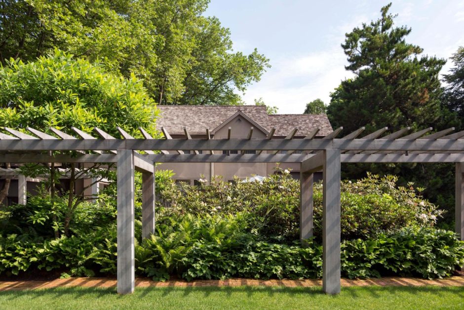
Juror Award: Huntting Lane / Adaptive Reuse — Blaze Makoid Architecture
This slightly shy of one acre site is located in the historic area of the Village of East Hampton and was originally part of a much larger estate. The original house, designed by Joseph Greenleaf Thorpe around 1903 had been torn down and in the mid 1980’s, the architect and designer, Benjamin Baldwin built a modest, contemporary home for himself. Subsequently, the property was sold and the house was converted and expanded into a more traditional design. This project focuses on the reuse of the abandoned foundation and redesign of the pathways, arbor and pool.
The existing entry drive hugs the western side of the property and included a drop off for visitors heading to the pool in its grandfathered location in an open lawn on the southern facing front yard. A rundown brick walkway was taken apart and rebuilt with the salvaged bricks and a more contemporary, robust arbor was installed with a Patinated Steel Sculpture by Simi Dabah sculpture as a focal point at the eastern terminus of the path – the pool lounge area.
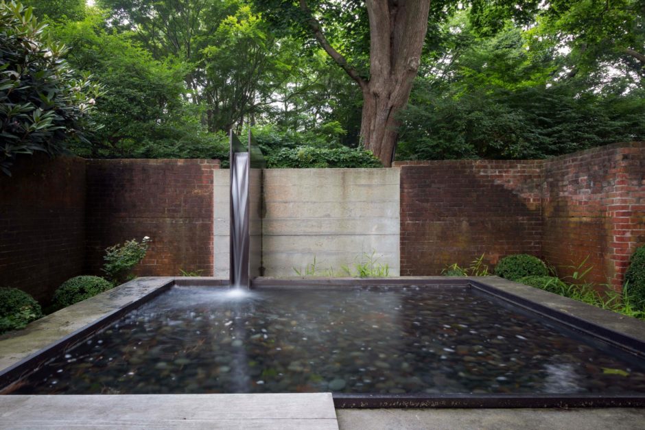
The existing foundation for the since demolished manor house is situated between the new house to the north and the pool area to the south. The project brief requested a series of outdoor spaces, ranging from contemplative to large scale entertaining. Inspired by the modernist, crafted interventions of Carlo Scarpa, the design attempts to insert new, well detailed elements that complement while also honoring the existing structure. Precast concrete stairs, board formed concrete landscape walls, cedar structures and steel details make up a strong, readable material palette.
The ‘hub’ of the project is a trellis covered lounge area located at the floor level of the main house, overlooking the sunken rooms. The most versatile area, it is used multiple times during the day and evening, with and without guests. Access to the lower spaces are via a grand stair of ‘floating’ precast concrete spanning fourteen feet. From west to east, three ‘rooms’ are arranged by function and time of day. The peaceful sound of water from a steel and concrete fountain provides a meditative space surrounded on three sides by plantings and on the fourth, a simple wood seat. The largest of the three spaces is the outdoor dining room with a custom table and seating for thirty to forty guests. East of the dining room, the ‘fire to water’ axis is completed by a board formed concrete fireplace and evening lounge.
Project Team Credits Below
============================================
Juror Award: House on the Point / Architecture — Stelle Lomont Rouhani Architects
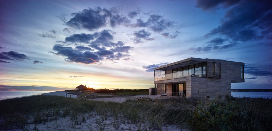
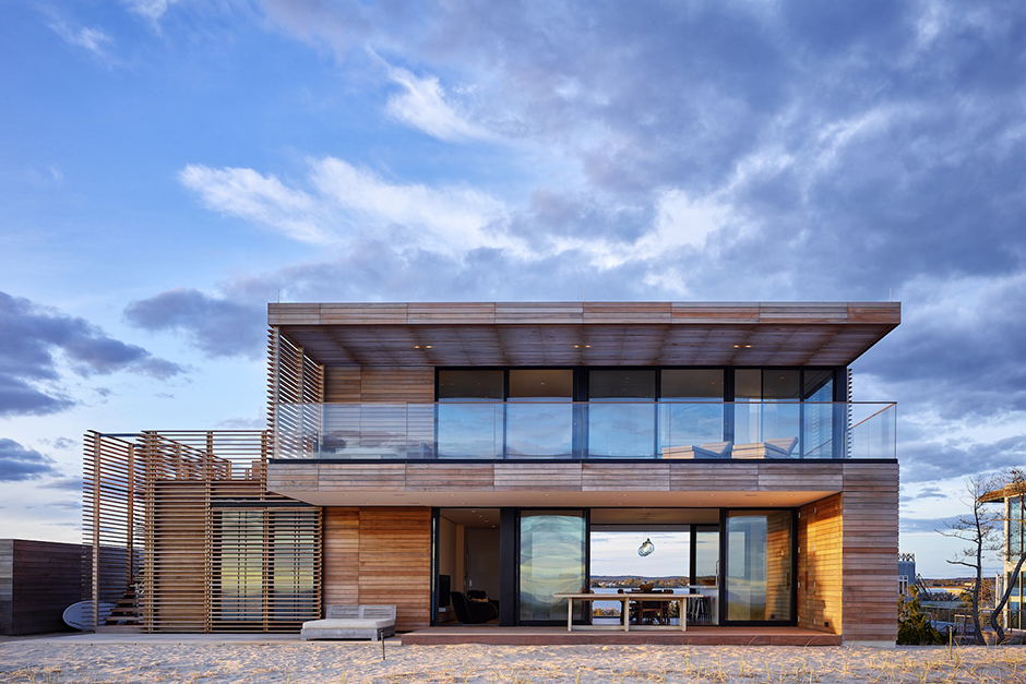
This modestly sized ocean front house is designed for an informal active family. Working with the constraints of a small footprint, every moment and view counts. The open plan transparent first floor connects ocean and bay views. A more private second floor prioritizes ocean front indoor-outdoor living and a strategically placed hot tub to enjoy bayfront sunsets from. Red cedar siding and anodized aluminum windows and doors bare the elements. Screens are employed to provide shade and privacy.
Project Team Credits Below.
============================================

2017 AIA Peconic Jurors
- Stephen P-D Chu, AIA from Ennead Architects
- William Randy McGee, AIA from ZGF Architects
- Earl Jackson, AIA from Earl Jackson Architecture Workshop
Projects categorized as Architecture, Historical Preservation, Adaptive Reuse, and Unbuilt Projects — nine awards recognizing three levels of excellence in architectural design. Submissions were real or conceptual but required to reflect a solution related to the built environment.
~~~~~~~~~~~~~~~~~~~~~~~~~~~~~~~~~~~~~
PROJECT TEAM CREDITS
Honor Award: Old Orchard / Architecture — Blaze Makoid Architecture
Project Team: Blaze Makoid Architecture / MCC – McLoughlin Construction Corp / Landscape Details – Landscape Architect / Orsman Design – Lighting / David Scott Interiors / Ed Armas Engineering , PLLC / Structural, M/E/P and Sanitary Engineering / Joshua McHugh, Photo Credit.
———————————————————————–
Honor Award: North Main / Architecture — Bates Masi + Architects LLC
Project Team: Bates Masi + Architects / Contractor, Bates Masi + Lettieri Construction / Photographer, Michael Moran/OTTO.
———————————————————————–
Merit Award: Mid-Century Modern Revived / Historical Preservation —
Austin Patterson Disston Architects
Project Team: Architect: Stuart Disston, AIA, & Joshua Rosensweig, Project Manager, Quogue Interior Designer: Giovanni Farn, New York / Contractor: George Vickers Enterprise, Westhampton / Landscape Designer: Susan Leitner, Brooklyn / Tria Giovan, Photo Credit.
AAQ Resource / Architecture: Austin Patterson Disston Architect
———————————————————————–
Merit Award: Georgica Cove / Architecture — Bates Masi + Architects LLC
Project Team: Bates Masi + Architects / John Hummel and Associates Custom Builders / J. Mendoza Gardens, Landscape Architects / Erica Miller Design, Interiors / Bates Masi + Architects, Photographer.
———————————————————————–
Merit Award: Atlantic Architecture — Bates Masi + Architects LLC
Project Team: Bates Masi + Architects / K. Romeo Inc., Contractor / Summerhill Landscape / Bates Masi + Architects, Photographer.
———————————————————————–
Juror Award: Guest House / Architecture — Roger Ferris and Partners
———————————————————————–
Juror Award: Black House / Adaptive Reuse — Oza / Sabbeth Architecture
———————————————————————–
Juror Award: Huntting Lane / Adaptive Reuse — Blaze Makoid Architecture
Project Team: Blaze Makoid Architecture / Dunham Brothers, Inc – Ken Rafter, Contractor / Gunn Landscape Architecture / Shine Lighting / Photo Credit: Eric Prine – Attic Fire Photography.
———————————————————————–
Juror Award: House on the Point / Architecture — Stelle Lomont Rouhani Architects
Project Team: Stelle Lomont Rouhani Architects (Viola Rouhani, Luca Campaiola, Damen Hamilton, Alexa Baker, Jessica Twiggs) / Fountainhead Construction / LaGuardia Design Group, Landscape Architects / Robert Silman Associates – Structural Engineers / Photo Credit: Matthew Carbone.
AAQ Resource / Architecture: Stelle Lomont Rouhani Architects
~~~~~~~~~~~~
VISIT PREVIOUS AAQ PORTFOLIOS / AIA PECONIC AWARD WINNERS
- AIA Peconic: 2013 Daniel J. Rowen Memorial Design Awards
- AIA Peconic: 2014 Daniel J. Rowen Memorial Design Awards
- AIA Peconic: 2015 Daniel J. Rowen Memorial Design Awards
- AIA Peconic: 2016 Daniel J. Rowen Memorial Design Awards
——————-

www.aiapeconic.org
_____________________________________________
