AIA Peconic Daniel J. Rowen Design Awards / 2020
Announced January 11, 2020
~~~~~~~~~~~~~~~~~~~~~~~~~~~~~~~~~~~
January 11, 2020, Ross School, East Hampton
AIA Peconic announces the winners of the 2020 Daniel J. Rowen Design Awards Program at a public event on January 11 held at the Ross School, Senior Lecture Hall in East Hampton. A Celebrating Architecture reception and People’s Choice Award voting preceded the Awards ceremony which was hosted by Bill Chaleff, AIA. The Awards were presented by Design Awards Chair, Bill Chaleff, AIA and AIA Peconic Past-President, Michele Hugo AIA to a highly receptive auditorium of guests and supporters of the work of local architectural firms and members of AIA Peconic. This year we also celebrated our student recipients of the AIA Peconic / Anthony DiSunno Scholarship program.
Our jurors found reviewing over 40 projects a rewarding challenge. Edward Siegel AIA LEED AP, Kim Yao AIA and Barry Bergdoll, Professor Art History and Archeology at Columbia University judged the projects and presented awards that recognized architecture, historic preservation, unbuilt projects and emerging architects and through the lens of their projects answered “How does this project address issues of time and place ?’
——————–
AWARD CATEGORIES
Honor Award: The project displays clear excellence in architectural design from concept through completion.
Merit Award: The project displays exemplary execution of design principles and presentation.
Juror Award: Recognizes excellence in resolving specific programmatic desires through interpretation of style, technologies, sustainability, materials, and / or vernacular influences. Juror awards are left up to the jury’s discretion and can be awarded for any project in any category.
People’s Choice Award: Recognizes excellence in architectural design as voted on by one’s colleagues and peers.
~~~~~~~~~~~~~~~~~~~~~~~~~~~~~~~~~~~
—————– Honor Award / Architecture —————–
Kiht’Han. Architect: Bates Masi + Architects
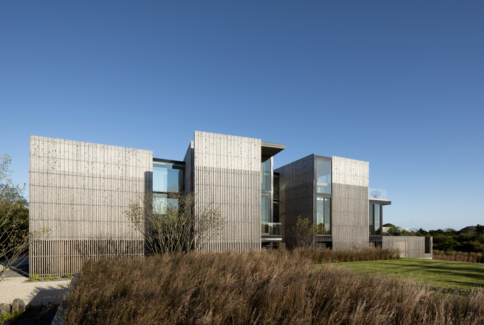
Too often the architectural response to flood-prone sites is to distort conventional designs and methods to meet the flood protection requirements, masking the issue at best. In contrast, the design for this property overlooking a coastal pond and the ocean beyond celebrates the periodically rising water levels. Rather than hiding the flood damage prevention measures, the design takes advantage of them, thereby embracing the duality of the wetland landscape to intertwine nature and built form.
The house, pool, decks, and sanitary field are elevated and broken apart to let flood waters flow around and between them, thereby reducing the potentially damaging hydrodynamic pressure of coastal flooding. Thus the house becomes a series of vertical volumes from which to observe the ocean view, the agrarian landward view, and the dynamic ground plane itself. Perched safely above, flooding becomes a non-threatening event, a periodic change in the home’s relationship with the ground. From the glass-enclosed bridges that connect the volumes, one can appreciate the dramatic spaces between the them, whether flooded in wet periods, or interconnected by flows of native plantings in the typical drier periods.
The composition of the volumes in the landscape is guided by program and the surrounding context. The orientations of each volume are influenced by the desire for ocean views or sights of the pastoral landscape and respond to the use that occurs within. Programmatically, pulling apart the spaces allowed for maximum privacy as four guest bedrooms are separated from the living areas and master suite. Communal spaces have flexibility to flow to the outdoors and extend onto elevated decks by means of full height sliding glass doors.
The building’s location, straddling the agrarian and coastal landscapes, inspired the articulation of the wood siding. The board and batten design is reminiscent of nearby vernacular structures while its two-layer composition allows for selective control over its opacity. At grade level the boards are omitted and the battens form an open screen to let floodwater flow through it per FEMA regulations. Above, overlapping boards and battens are opaque to mask neighboring houses from view. At the roof line, the battens are omitted to let light filter between the boards. The transitions between the varying opacities occur along horizontal datum lines that ring the towers, breaking up the verticality of the facades and referencing tide lines left by fluctuating water levels.
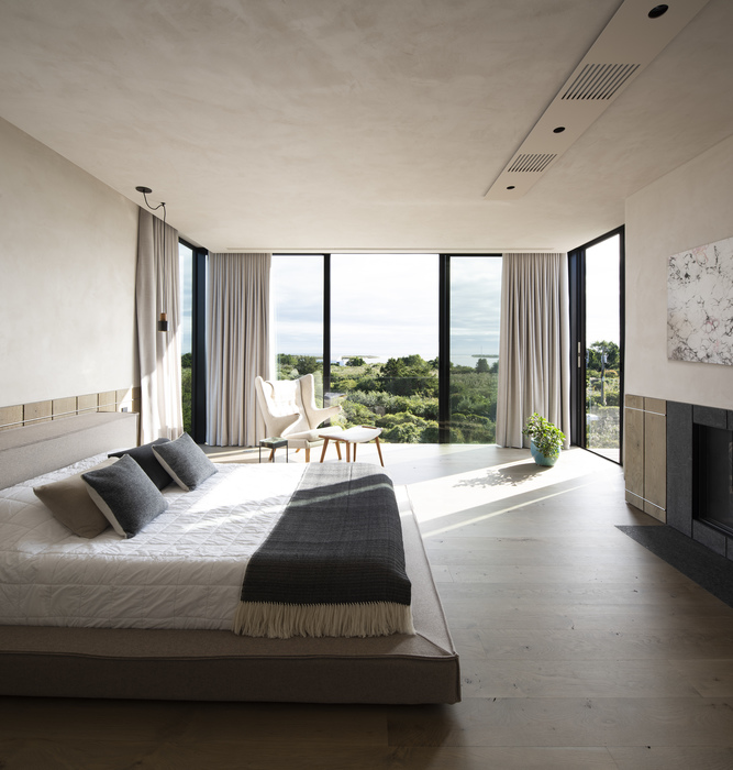
The language expressed by the exterior siding translates to the design of the interior spaces as well. The horizontal datum lines are visually transcribed onto the interior walls by means of material transitions for interior finishes and wall claddings. Wood clad walls at the first level transition into wainscoting and light painted walls at the upper floors. This visual link expresses the seamless connection between interior and exterior as one travels throughout the house.
By creating a homogenous relationship between the architecture and nature, one is constantly reminded of the place in which they reside. Natural elements are invited into the home and are experienced on a daily basis, thus becoming a part of everyday life.
———————
Architect: Paul Masi; Contractor: K. Romeo, Inc; Photo: Bates Masi + Architects.

www.batesmasi.com
~~~~~~~~~~~~~~~~~~~~~~~~~~~~~~~~~~~~~
—————– Honor Award / Emerging Architect —————–
House 9. Architect: The Lacuna Project
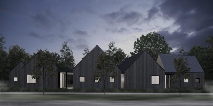
house 9, 2019 (under construction)
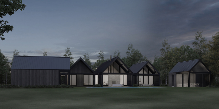
4800 s.f., (4) bedroom, (4) and (2) half-bath, single family residence with pool and 550 s.f. pool house
Standing seam zinc roofing, stained vertical tongue and groove cedar siding, powder coated aluminum doors and windows, and cast in place concrete
$1.5m construction cost
house 9 is a luxury, modern, single family, retreat located in Shelter Island, New York. This wooded property presented a unique opportunity to collaborate with the client to create a bold, stealthy and sustainable home. The owner’s aim was to create a sanctuary away from the contemporary bustle of city and digital life; an inward-looking space, with muted materials, that required little maintenance and presented a meditative sense of peace and calm.
———————
General Contractor: Sean Murphy Contracting.

www.thelacunaproject.com
~~~~~~~~~~~~~~~~~~~~~~~~~~~~~~~~~~~~~
—————– Honor Award / Historic Preservation —————–
Antler House. Architect: Architecture AF
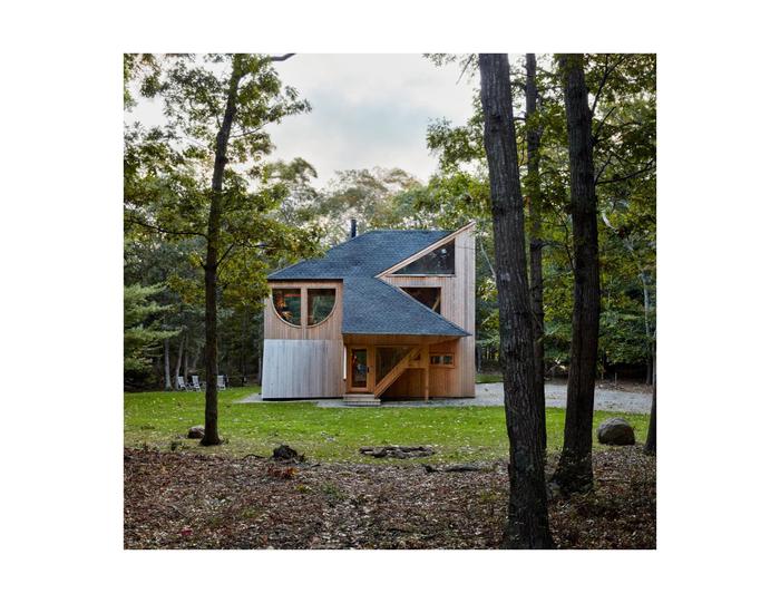
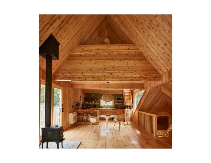
The joyous, playful and wildly creative vacation homes designed by Andrew Geller in Long Island are only now coming into due appreciation. The Antler House, built in The Springs of East Hampton in 1968, was perhaps his most whimsical. Over the years, new owners replaced original quirks with standard building features, and tacked on pragmatic additions. Our clients fell in love with the “wooden spaceship in the forest” and commissioned us to restore it to its former glory, and add a few modern comforts. With original drawings in hand we happily obliged.
Although much of the project is characterized more by additions removed and original materials replaced, our contribution to the Antler House can be found in the addition of the raised deck. Placed on the more private West facade. We borrowed a triangle for the deck’s stair and used an original handrail detail to screen the vacation home toys. The restoration features meticulous recreations of Geller’s original “owl-eye” and replacement of all invasive gypsum board with fragrant #2 cedar. We removed an inappropriate bathroom addition from the East facade facing Neck Path, and replaced it by reconfiguring the original first floor bathroom into two full baths.
A conservationist at heart, Geller believed that no house should occupy more than 20% of the site. In a neighborhood replete with trophy homes, we are proud and gracious to have had the opportunity to restore a mid-century work of art that another owner may have razed. We hope that our work on the Antler House would have made Gellar proud.
ARCHITECTUREAF
architecture.af
~~~~~~~~~~~~~~~~~~~~~~~~~~~~~~~~~~~~~
—————– Honor Award / Unbuilt Projects —————–
Herrick Park Proposal. Architect: MB Architecture
Herrick Park, Empowering the Community
A Design Proposal & Invitation to Participate Unbuilt / Research
Location: East Hampton Village
Project Description:
The Park as a Unifying Urban and Social Hub
~~~~~~~~~~~~~~~~~~~~~~~
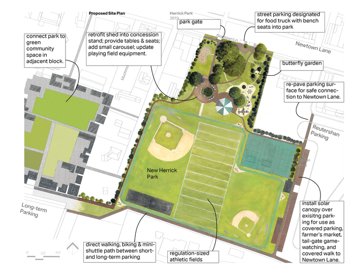
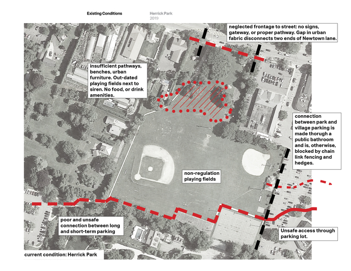
Our analysis of current conditions at Herrick Park in East Hampton Village and our subsequent design proposal for its improvement -as a park and as urban tissue- are less suggestive of a finalized design solution and more an effort to empower the community to tackle a critical urban deficiency.
Living and working in the village, and experiencing first-hand the design stalemate that has prevented meaningful improvements, we took it upon ourselves to create this set of documents to help the village board and the community envision possibilities and demand productive outcomes. We hope to show that incremental changes, when focused on long-term urban solutions, can have a transformative and regenerative impact over time –restoring the village forward.
Technically speaking, Herrick Park is a segregated outdoor space. Both its various usages within, and its connection to urban adjacencies outside, are driven by mutually exclusive factors that often act in conflict. For example, a large portion of the park is used as athletic fields by the Middle School across the street; but participation of the general community in game-watching or use of those fields are unsupported — therefore non-existent. Conversely, the recreational portion of the park, fronting Newtown Lane, is devoid of necessary amenities such as proper pathways, benches, support amenities and attractions for the general community; and is, therefore, mostly empty. And finally, while the park sits between two village hubs, its luxury retail core and a burgeoning light retail and affordable core, because of its poor infrastructure, the park fails to act as connective tissue between them, and fails to spread foot traffic and thus reduce congestion. Were it to succeed in overcoming these challenges, East Hampton Village would restore its sense of community, and retain its traditional role as a congenial and functionally active center of the larger Town of East Hampton.
We started this process by asking ourselves: “In what kind of town do we want to live?”
We begin to imagine, and invite the community to envision with us, the place we would all like to live.
———————
Proposal by MB Architecture, Maziar Behrooz & Bruce Engel.
MB ARCHITECTURE
www.mbarchitecture.com
~~~~~~~~~~~~~~~~~~~~~~~~~~~~~~~~~~~~~
—————– Merit Award / Architecture —————–
Shooting Star. Architect: Blaze Makoid Architecture
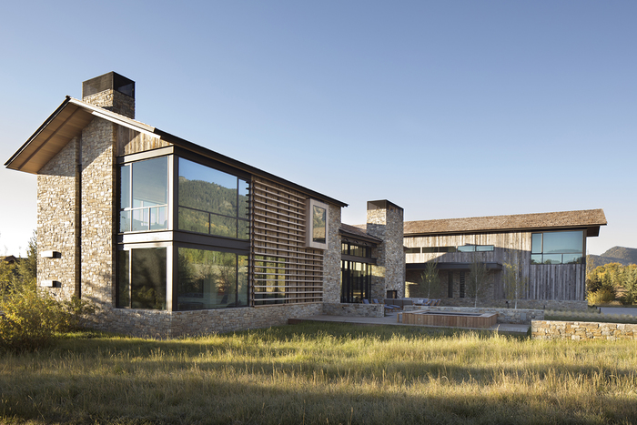
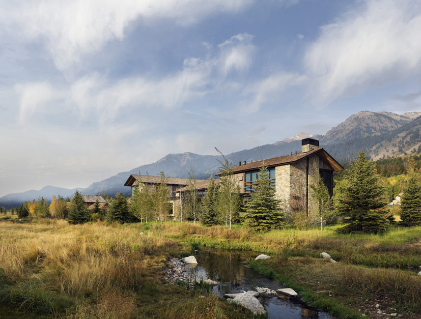
This 8,650 square foot home, designed for a family of five, is situated on the Jackson Hole valley floor, surrounded by the Teton Mountain Range, at the base of Jackson Hole Mountain Resort. The high altitude and steep mountain slopes contribute to bitterly cold winters and mild summers in the valley and attract a diverse population of wildlife such as bear, elk and moose as well as many active vacationers and residents. The clients are avid skiers as well as kayakers, runners, golfers and bikers.
A long, covered walk leads to a single story, glass entry hall that both links and divides two, two story wings. The South wing consists of a vaulted Great Room, Kitchen and Dining areas as well as Cocktail Room and Home Office on the first floor and the Master Suite above. The North wing on the opposite side of the Entry Hall houses the Bunk Room, Laundry, Ski Room, Garage/Gear Storage and outdoor Ski Lockers. Guest Suites and TV Lounge make up the balance of this wing. The home’s main outdoor living spaces are pushed to the front of the site, to take advantage of mountain views as well as the warm sunsets.
The project’s modern exterior aesthetic is balanced by the design’s nod to local vernacular architecture and climate. The cedar shingle, gabled, cold roof is engineered to hold snow in the winter and disappear into the landscape from the mountain. The roof’s eaves extend to protect the reclaimed barn wood sided walls form the elements. A ribbon of rustic local fieldstone runs the perimeter of the project’s base and turns vertically to clad chimneys and feature walls.
———————
Interior Designer: Kelly Hohla Interiors; Landscape Architect: Hershberger Design; Contractor: Dynamic Custom Homes; Photographer: Paul Dyer.

~~~~~~~~~~~~~~~~~~~~~~~~~~~~~~~~~~~~~
—————– Merit Award / Architecture —————–
Acton Cove. Architect: Bates Masi + Architects
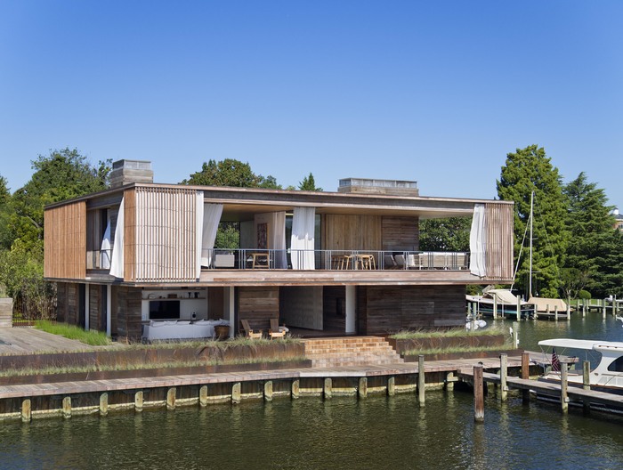
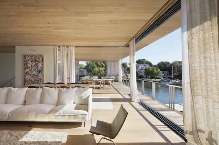
surrounded by the maritime charm of Annapolis Harbor. They found a small but spectacular lot with a house on it from the 1970’s. The existing house did not meet the owners’ needs but its bulkheads and docks provided a unique opportunity: the chance to build a home just steps from the water in downtown Annapolis. As the previous house was demolished, layer upon layer of old bulkheads and fill revealed how generations of previous owners had expanded the site into the harbor and reinforced it from the elements. This process of layering inspired the solution to the current design challenges – the harsh coastal environment and the privacy issues of being in close proximity to neighbors and active waterways.

www.batesmasi.com
~~~~~~~~~~~~~~~~~~~~~~~~~~~~~~~~~~~~~
—————– Merit Award / Historic Preservation —————–
Sagaponack Farmstead. Architect: Martin Architects, P.C.
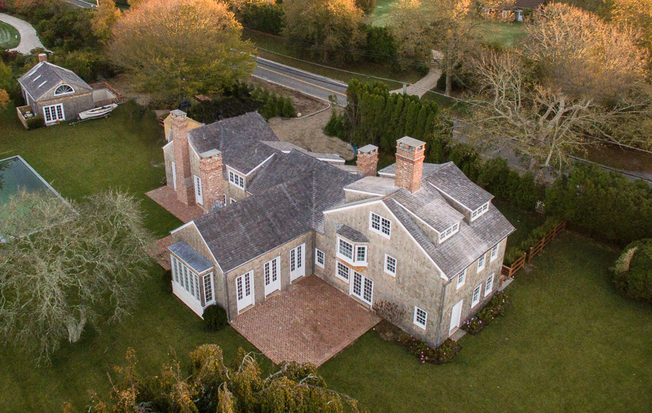
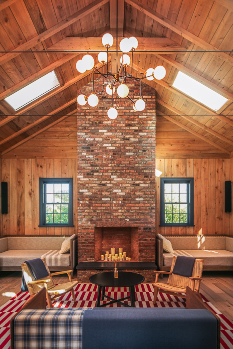
350 years in the making since the first English settlement colonial period of the community of Sagaponack, Sagg or “place where the large ground-nuts grow” sits a farm Holstead located in the larger parish of Southampton. 1785 was the year that the Halsey family-built structures one at a time which created a family courtyard adjacent to the acreage that they farmed. This was pristine rich loam soil and the family thrived with the Master as farmer and the mistress gardening, cloth-making with the spinning wheel in wool or flax. The compound changed as the family’s needs changed with more buildings added with various scope.
Sagaponack has changed little until its last years: always one schoolhouse, one store, and port from which to export whale oil and farm produce.
Fast forward to 2015, our historically conscientious minded client purchased the dilapidated series of structures that have since suffered several unrequited garish additions and were left fallow long enough to be structurally close to collapse, further the land had been subdivided keeping only the west structures in their hands. Persistent in the fervor to return the buildings to their original colonial era vernacular, the goal was set to restore, provide some additions and filter the non- important elements. Through major editing, collecting historical records and following the original tenants of the Colonial Architecture Vernacular, the houses were recorded, original materials collected and design set. As an example of replicating original materials Sag Harbor was historically a sister village to Stonington CT, as a result this house used stone from Stonington harvested from the Whale ships ballast. We sourced additional material from Stonington CT to keep within the legacy. Two of the houses were lifted and then set on new foundations, all were renovated with the latest sound builder practices and to code requirements. The result is a harmonious thoughtfully scaled historic renovation and addition that has honored its roots in history.
———————
Owner & Interior Design: Tony Woods; Project Team: Nick Martin, Amelia Steelman; Builder: Ian Evans Construction; Engineer: Edward Armus Engineering.
MARTIN ARCHITECTS
www.martinarchitects.com
~~~~~~~~~~~~~~~~~~~~~~~~~~~~~~~~~~~~~
—————– Merit Award / Unbuilt Projects —————–
Sagaponack. Architect: Blaze Makoid Architecture
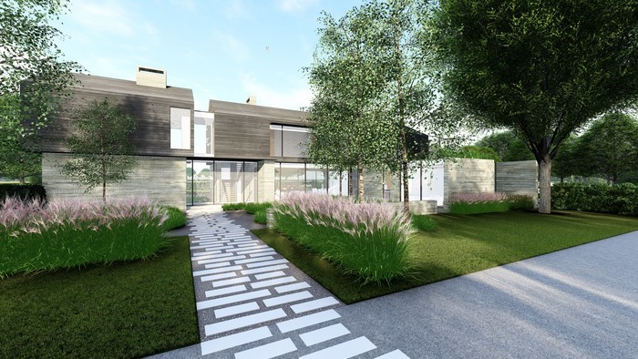
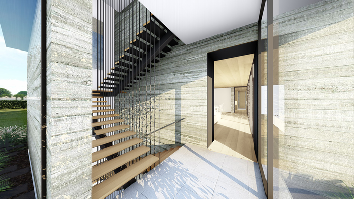
What happens when a traditional barn meets a mid-century modern beach shack? Drawing from Sagaponack’s enduring history as ultra-fertile farmland and its legacy as a hotbed of experimental modernism in the 50s and 60s, this project expresses the locale’s dual identity. At the minimalist main level, expansive windows meet walls of board-formed concrete that pull past the building enclosure and extend into the landscape. A gabled “barn” wrapped in rich shou sugi ban siding rests atop these. The horizontal boards of the barn mirror the imprint of boards below.
The house faces an agrarian reserve and the clients requested that exterior spaces and elevated pool take advantage of the unobstructed views. A roof deck offers a sweeping vista across the farmland, where gentle winds transform ryegrass into a rippling green ocean.
The interiors have been designed for carefree days, laid-back entertaining, and cozy nights. An open-plan living and dining room features full glass on two sides, dissolving the boundary between indoors and outdoors. With seven bedrooms, a bunk room, gym, den, home theater, covered outdoor living and dining space, and oversized pool, this home offers resort living at its best.
———————
Renderings Blaze Makoid Architecture

~~~~~~~~~~~~~~~~~~~~~~~~~~~~~~~~~~~~~
—————– Jurors’ Award / Architecture —————–
Office Barn. Architect: Stelle Lomont Rouhani Architects
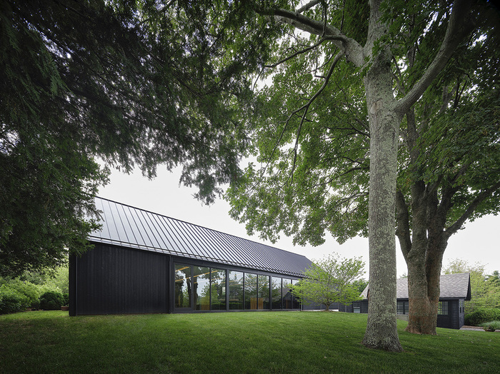
The office barn was created for a local Landscape Architecture office. The firm had experienced rapid growth, and had outgrown their former office space. Inspired by the open plans of many of our residences, they came to us to create a similar environment for their workspace. An indoor/outdoor relationship, allowing the natural light and landscape to be easily visible and accessible from multiple points within the structure was a key driver in the design. The structure is located towards the back of a multi-use property. A single-family house, and small gabled structure already existed on the lot.
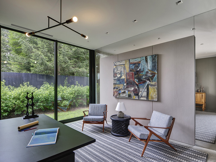
The surrounding area has an agrarian history, and metal roofed farming structures and their associated houses dot this east end hamlet. The office barn takes its cues from this local vernacular, simple in shape. Having spent much time in Japan, the Landscape architects were drawn towards the idea of shou-sugi-ban. The openness and light within only starts to reveal itself upon entry. A Japanese inspired entry garden takes the visitor from the parking area, into the open floor plan office space. Once inside, the brilliant surroundings come into view with an expansive wall of glass facing east and the garden between the office and the residence. Flanking each side of the open space are defined rooms, conference room, and the founding partners office on the right, library/eating area, kitchenette and washrooms on the left. The staff has their own entrance complete with mud room for work boots.
Throughout the space, wood of varying species can be found in furniture, and cabinetry. A large working table, constructed of slabs of oak, plays a central role in the open work area. Everyone benefits from the natural light from within the office, while the outside serves as a growing showcase of landscaping.
The combination of the integrated landscape plan, highlighting native plants, and the simple, agrarian shaped structure speak together to the location, creating a familiar dialogue that has existed in the area for centuries. Timeless in approach, the structure will continue to stand as the landscape grows and evolves around it.
Project Team: Viola Rouhani, Jonathan Subject; Interior Design: David Scott; Contractor: Kiwi Construction; Lighting Designer: Orsman Design; Planning: Inter-Science; Structure: Stephen Lamanski; Landscape Design: LaGuardia Design Group. Photo: Matthew Carbone.

www.stelleco.com
~~~~~~~~~~~~~~~~~~~~~~~~~~~~~~~~~~~~~
—————– Jurors’ Award / Architecture —————–
Amagansett Case Study # 6. Architect: MB Architects
Amagansett Modular Architecture Category
Project Brief: 1500 sf single family, 4 bedroom house with pool, located in Amagansett, on a .34 acre wooded site.
Our clients, a couple with 3 children, had purchased a triangular, wooded, corner lot on high ground in Amagansett, and contacted us to explore means of building a house for their summer and year-round-weekend use. The site is constricted due to its shape, but, due to its elevation, affords beautiful sunset views and light. Programmatically, we were asked to provide 4 bedrooms, 3 shareable bathrooms, kitchen and living spaces; plus, outdoor eating and recreation areas and a pool; and enough lawn area to play games.
More critically, our clients had a limited budget—significantly below prevailing construction costs. They were open to exploring materials, methods of construction, and design strategies that would yield both affordable and exciting solutions.
Based on prior experience, we knew that conventional ‘stick-build’ construction using local labor would be prohibitively expensive. We suggested prefabricating the building off-site; and use of shipping containers to lower cost, ease transportation, and provide the kind of design experimentation that they were open to. Our past work proved that by streamlining this process, we could achieve significant cost reductions.
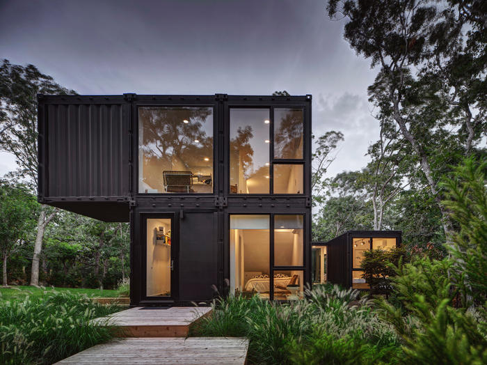
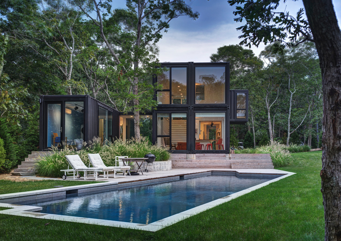
But shipping containers are inherently narrow (7’-2” wide, finished inside). So, we opted to stack two 40’ long x 8’ wide containers on top of two and carve out the interior floor/wall/ ceiling of half of this ‘4-pack’ unit to create a voluminous, 17’ tall, living space that would create an exciting and necessary spatial relief. To reach the second floor from this room, we chose to install a wide staircase, taking the whole width of a single container; in this manner, we extend the high living room ceiling and transform the stair itself into a kind of ‘amphitheatrical’ room that faces the backyard, pool, and sunsets—through floor-to-ceiling, wall-to-wall, windows.
Simplicity of spatial layout and materials were sought to yield compelling and uncluttered rooms while achieving budget goals. As such, we used the rectilinear geometry of containers, and their inherent structural strengths to guide room layout and structural requirements. In fact, the small 10’ x 10’ 2nd floor extension is essentially bolted and welded back to the main building and held in tension—it is devoid of beams underneath.
The single container housing two bedrooms is placed slightly away from the main building to create courtyard-like outdoor spaces that allow the building to nestle into the sloping landscape, while making the small house feel spacious.
A single tall oak tree was carefully retained during construction and maintains a pivotal point anchoring the two parts of the building together. The transparent bridge connecting these two building parts is surrounded by tall grasses and shrubs creating a pleasant walk-through experience both as one travels through the bridge and as one approaches the front door of the house.
Our building was installed in two days; fully completed in two months; and cost significantly and meaningfully less than prevailing building costs.
———————
Lead Architect: Maziar Behrooz; associate, Bruce Engel; intern, Eudine Biancardi. Builder / General Contractor: Charles Gallanti Inc.; Structural Engineer: Keith Ewing; Landscape Design: MB Architecture.
MB ARCHITECTURE
www.mbarchitecture.com
~~~~~~~~~~~~~~~~~~~~~~~~~~~~~~~~~~~~~
—————– Jurors’ Award / Historic Preservation —————–
Ram Island. Architect: DiSunno Architecture, P.C.
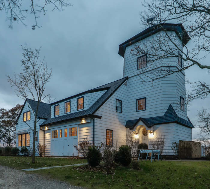
RAM ISLAND
On the North shore of the South fork of Long Island, surrounded by Bull Head Bay, Sebonac Creek and the Great Peconic Bay is a tiny island, approximately 25.8 acre in size, named Ram Island. Its remote location is accessed by a small bridge, barely detectable from its neighbor across the street, National Golf Links.
While owned by the same family for generations, the 25.8-acre parcel was subdivided and allocated to members of the same family. 15.2 acres, on the Northside of the island, became the backdrop for the vision to create a magnificent family compound.
Originally the property included 5 separate buildings, each with historical relevance, which generated an exciting restoration project that spanned several years.
Included in the scope of this project was to relocate two of the structures, re-imagine the use of three of the structures, design a new building & undergo extensive renovations to each of the original homes.
At the completion of the project the new compound includes 6 separate buildings. A main house, guest house, pool house, playhouse, dock building, and a dock house.
The main house was originally used as a “pump house” and included an architecturally significant feature in the existing water tower. However, the house was not situated in an ideal location on the property. In the original location the house did not optimize the stunning water views that were possible in the alternate location.
Once the structure was moved to its new location, the interior design was modified to create better flow, and a more contemporary aesthetic. The tower was re-imagined with a circular stairway clad in white oak, that leads to unique office space with walls of glass and views across the harbor.
In the original location of the pump house, a new guest house was designed and built. The home provides separate living quarters for extended family and guests offering 3 bedrooms, 2 bathrooms and a large entertaining living/dining/kitchen area with walls of glass that frame the exterior vista’s and provide just a slight interruption between indoor and outdoor living.
The pool house was moved a slender 7 degrees to be square with the structure that is now used as the playhouse. In its original iteration the pool house was used as a caretaker’s workshop. The proximity of this building to the pool made it the ideal space to create a comfortable place to unwind and refresh while enjoying an afternoon in the waterside pool. A minimalist design was contrasted with an old-world aesthetic by using natural stone, exposed beams and original fenestrations.
Square to the pool house the former guest cottage was repurposed as an open plan, two-story playhouse/party barn. The original kitchen and bedroom were removed in order to create the new space.
———————
General Contractor: Ben Krupinski Builder. Interior Design: Atelier AM. Miranda Brooks Landscape Design.


www.disunnoarchitecture.com
~~~~~~~~~~~~~~~~~~~~~~~~~~~~~~~~~~~~~
—————– People’s Choice Award —————–
Shooting Star. Architect: Blaze Makoid Architecture
See presentation above.
============================================
AIA Peconic Jurors
Our jurors found reviewing over 40 projects a rewarding challenge. Edward Siegel AIA LEED AP, Kim Yao AIA and Barry Bergdoll, Professor art History and Archeology at Columbia University judged the projects and presented awards that recognized architecture, historic preservation, unbuilt projects and emerging architects and through the lens of their projects answered “How does this project address issues of time and place?”
============================================
VISIT PREVIOUS AIA PECONIC AWARD PORTFOLIOS
-
AIA Peconic: 2013 Daniel J. Rowen Memorial Design Awards
-
AIA Peconic: 2014 Daniel J. Rowen Memorial Design Awards
-
AIA Peconic: 2015 Daniel J. Rowen Memorial Design Awards
-
AIA Peconic: 2016 Daniel J. Rowen Memorial Design Awards
-
AIA Peconic: 2017 Daniel J. Rowen Memorial Design Awards
-
AIA Peconic: 2018 Daniel J. Rowen Memorial Design Awards
————————————

www.aiapeconic.org

