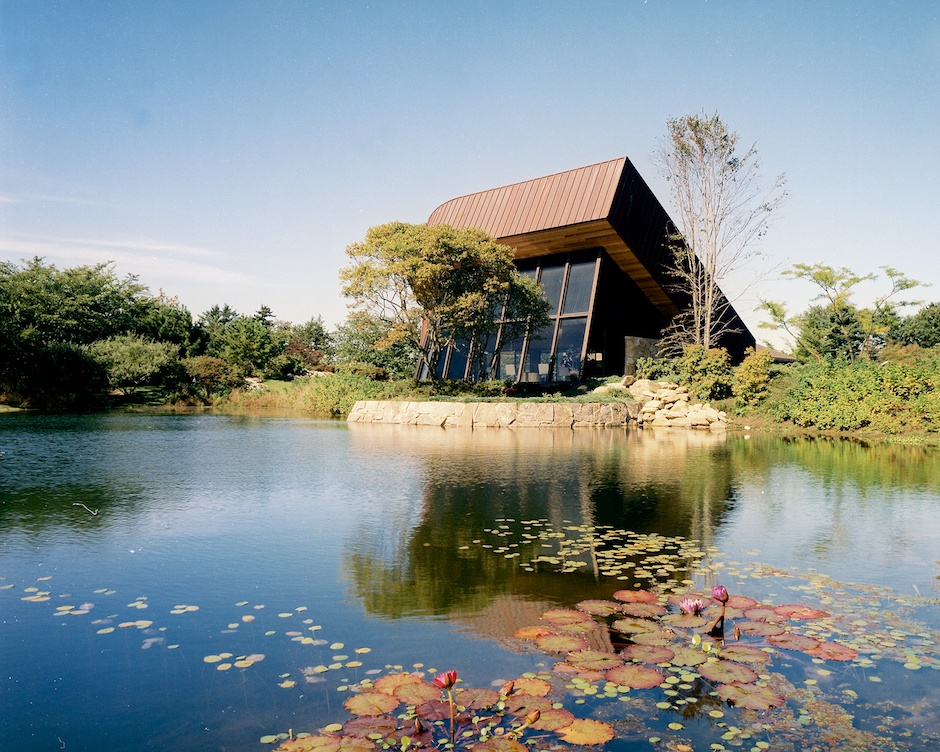
 Peter Cohen House, 1983
Norman Jaffe: Thoughts on Architecture
November 28, 1983
The influence of sunlight, the positioning of the structure in the sunlight, the influence of shadow, the movement of the sun, landscaping the site — we start with the premise that what is here is superior to what we will do. In order to do something worth doing, we should strive for a harmony between what is here and what will be here.
Imagine the building as a composition and its tonal value relative to the sky plane and the ground plane. I think there is a rhythm of shadow on the land that existing vegetation makes, and, that one can learn from the long shadows of early morning and twilight. Roof plans catch the sky, and I like to think that we work with roof planes in a dynamic state. Being in a state of motion, they might have less authority and, therefore, be more real. The cloud formations change but, if we hammer away at the geometry — so that there is a sense of movement, as well as order — we can reflect the clouds, even the light.
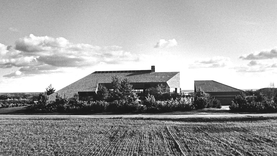 Ed Cohen House, 1984
One method we call “trapping the sky.” At the Ed Cohen House, we separated the building into two buildings and caught the sky between those buildings. Philip Johnson did this and brought this to our attention in Pennzoil — from a distance a slot of sky is caught between the two buildings. Another way to catch the sky is to see through the building. The building becomes transparent, therefore, lighter. We want heavy things to be light and light things to be heavy. Doesn’t the appearance of a dark mass of clouds in the sky add more light to the light and more dark to the dark?
Massing of the forms against the sky plane — I think an allee of trees with light at the end, makes one feel how big or small their automobile is or they are. At Ed Cohen’s House we use the device of an approach through a fairly constricted entry to a parking courtyard. At the Peter Cohen House, we used a bridge, where you enter the house under a bridge in a shadowy area up into a light-well.
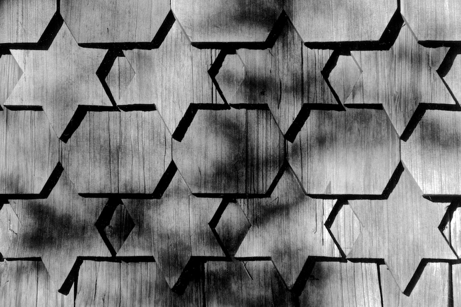
Architects work with such cold substances that are so well defined that it is difficult to compose them in a way that is expressive of the natural beauty of the site before we start. The use of materials with the light is important. For example, the light on the roof. We like to catch it with a texture. We don’t like flat roofs. We build flat roof houses, but they are too abstract. The reality of light and shadow becomes apparent in a tile roof or a shingled roof where each shingle tells the story of how it was laid and tells the story of the light having a surface in light and a surface in shade. Tile roofs have a nubby, rich texture. At the Peter Cohen House, we used copper with a heavy batten seam, not a standing seam, but a seam two by two to punctuate the dark and light on the surface itself, the play of light. The selection of roof materials — the celebration of the light on the surface — is most important.
When I sketch trees, I have difficulty rendering the light falling on the leaves, but recently I realized that I was trying to show light making visible and not the leaves — what helped me somehow was to think that the object was interrupting the light and that the light was prevalent. Once grasping the real force of light, I thought that the forceful things are the things we don’t hear, the quiet things, which have real power; once grasping the power of the light and seeing the tree, its branches, its leaves, as simply an interruption of that phenomenon of light helped me to draw that tree.
One should look at a building as a series of planes, and intersections of planes enclosing a space, yet open in such a way that the light is a presentation of uninterrupted light — by interrupted light meaning the light changes within the building but the light is ever-present. For example, at the Hillman House in East Hampton we have many high windows at different parts of the house, some clerestory windows, some skylights, some very low windows so that at virtually every time of day there is direct light into the building and a shadow pattern also, which is important because if one floods a room with light evenly one loses a sense of shadow, important to the expression of light. And, I think, that expression of light, that sense of it, adds to our sense of well-being, which is one of our jobs as architects to provide in a home. So, the floor plan itself is very much concerned and pushed by the presence of light. Where the kitchen goes, the TV, or whatever objects the house holds — nothing is as important as the expression of light, particularly in country houses where one has the opportunity to reveal the dramatic play of light and shadow.
Materials are critical, as well. Why have a stone wall, for example, if you cannot get light onto it to reveal the depth, texture, and color of the stone? Many of our stone walls are lit directly by skylights, punctuating the cleavage of the stone, which makes the color and texture sparkle. Lighter materials — light woods, for example — have a subtlety in grain which require a lot of light to reveal.
Very often mistakes are made by putting large windows on one side — where the ocean view is, for instance — and not back-lighting it to balance the strong light, establishing a glare situation, which defeats the purpose of the view. So, there is, I think, a subtle quality in placing openings in a composition. I would not call it exactly balancing, but I would call it composition.
Are there rules for composition? I don’t think so, except to avoid the custodial, the bossy, pushy, often boring plan that would deprive the occupants of the house the joy of the site.
One might talk about light through a window as one might talk about light in the clouds in the sky. Is the wall around the window dark? Does the light through the window reveal the texture and form of the walls, making less of the opening itself? The moment one sees out through an opening, one calculates its size, the amount of light this opening introduces. The overhang or trim of a window has much to do with its expression. Overhangs, deep trim, many architectural devices can be used to express the opening.
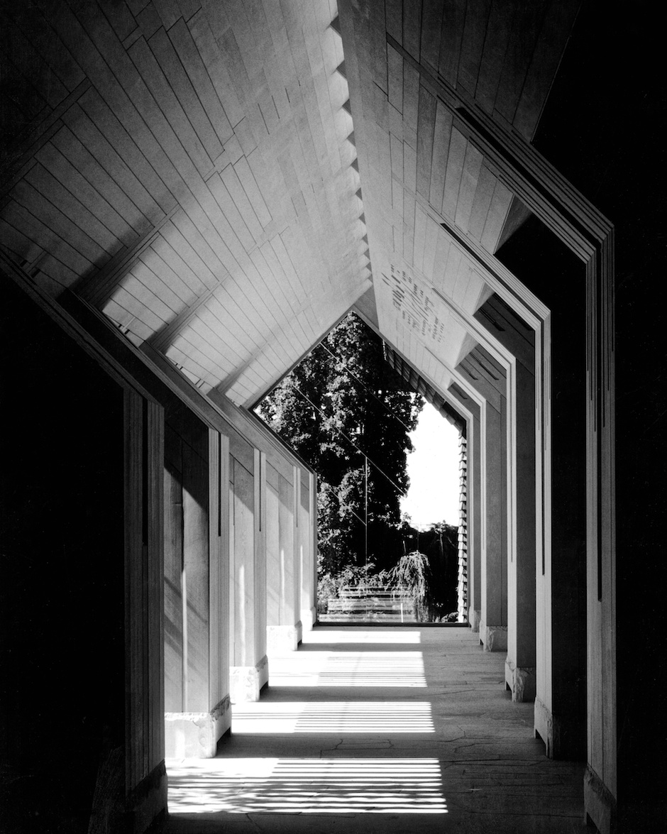
There is a dramatic difference between a window and a skylight. Skylights bring light in, windows frame views. Perhaps, if we thought of windows as skylights and less as frames, our architecture would be strengthened. The views change as we move. The rhythm of the space between the windows, if it is a series of windows, how light or dark the mullion is, should be a function of what that window is looking out upon. One knows that there is motion, things around the corner. There is a series of different types of shade and shadow showing in the building. There are many planes, soffits, overhangs — a composition. The master of this is Piranesi in his drawings — there is an indoor epic environment which has a presence not equal to the great majesty of nature but, at least, perhaps, through its dynamic composition of planes and forms reveals the light as the light changes, stands up, accounts for itself, and brings man closer to the elemental forces.
We love skylights to the south because they bring in direct sunlight, which expresses the light as it occurs outdoors, and the elements that we place in front of the light interrupt that light and cast the shadows — shadows, though temporary, become more enduring than the element that cast the shadows because they speak of a greater power.
The simplest kind of artificial light is to place the lights in the skylight and window openings, light that follows the way daylight comes into the building. This would be the moonlight effect. We have used different devices. In the Leichter House, we have a hole on the outside of a deep overhang, which brings light into a box and the light box pulls it into the room. In the Joseph Wohl art gallery, we brought light through a skylight into a painted, reflecting horizontal tray, which then reflected the light onto the paintings.
Color is hard for me to separate from texture. Revealing the integral color of the material itself is revealing its texture. If we paint a handrail or trim that is adjacent to a natural material, we paint it to reveal the natural material. I think of color, first, in terms of value. Is it dark or light? If it is dark, it will not show shadows, and if it is light it will really ring up those shadows. Even with wood — staining or finishing results in a glossy finish that reflects rather than absorbs the light, losing some of the subtleties of grain and texture that are apparent in natural wood surfaces. Contrasts between materials are measured in light. If you have a slate floor against a stucco wall, then you are dealing with the most violent of contrasts and require accordingly appropriate light. If you have a Tennessee stone floor against a honey-colored maple wall, you have more subtle contrasts, more absorbing, less reflective surfaces.
But, for me, the underlying journey one wishes to send his client on — the one living in the house — is that of experiencing the wonder of light itself, with materials used and lit to express their qualities, detailed to be seen for themselves, connected with consideration of tonal values.
The ultimate goal is an architecture that reveals light and light that reveals architecture, not one at the expense of the other.
—————————————————
Norman Jaffe: Thoughts on Architecture from an interview by Jeff Heatley, November 28, 1983.
—————————————————-
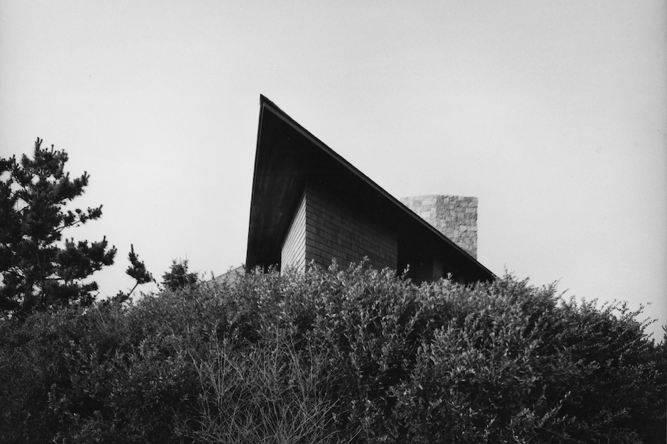 Bliss House, 1977
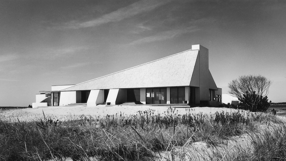 Arnold House, 1985
____________________________________
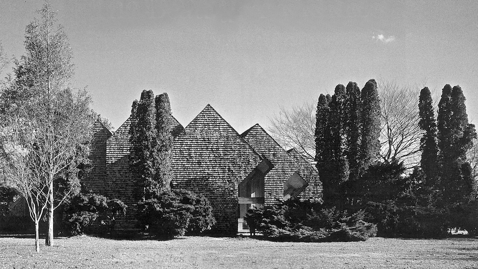
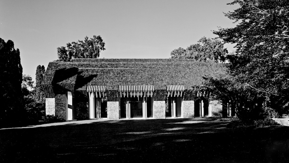
——————————-GATES OF THE GROVE, 1988——————————–
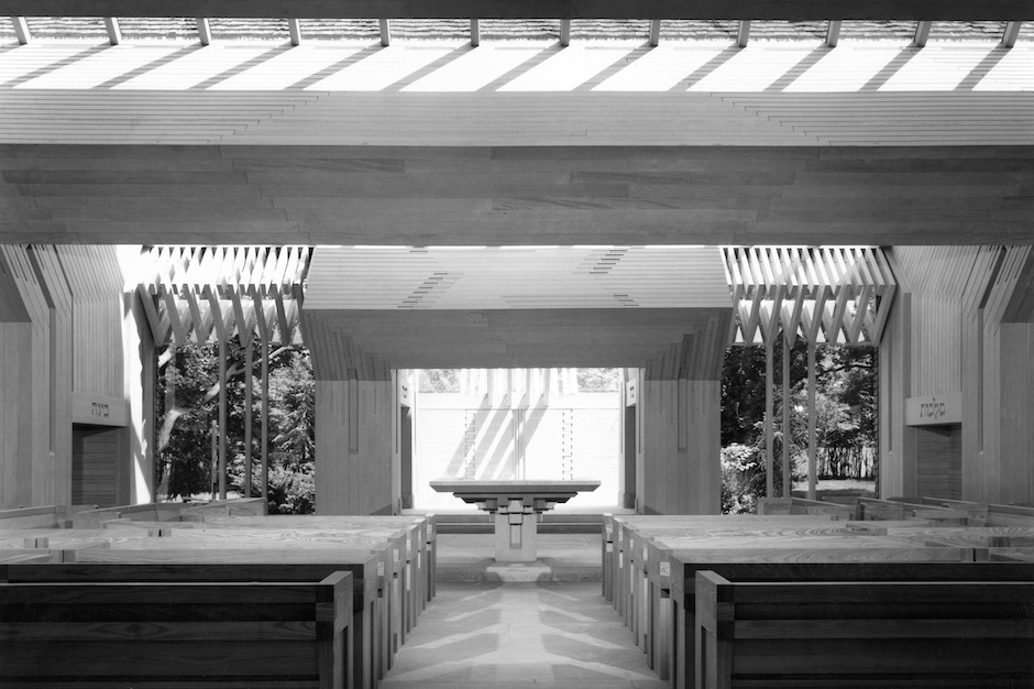
~~~~~~~~~~~~~~~~~~~~~~~~~~~~~~~~~~~~
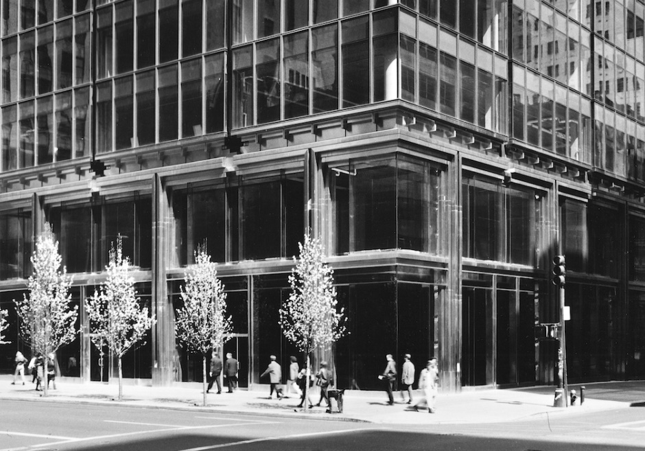
——————————-565 Fifth Avenue, NYC, 1993——————————–
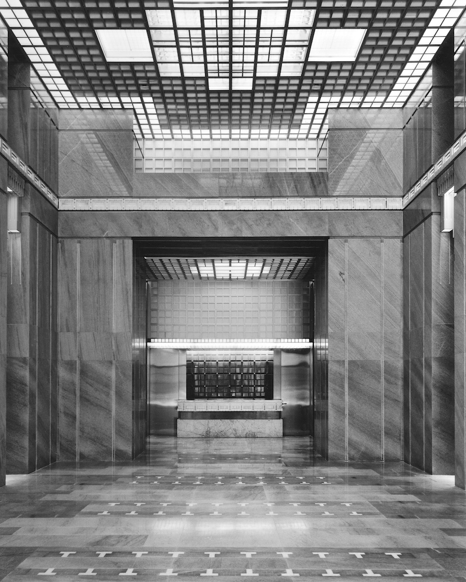 565 Fifth Avenue, 1993
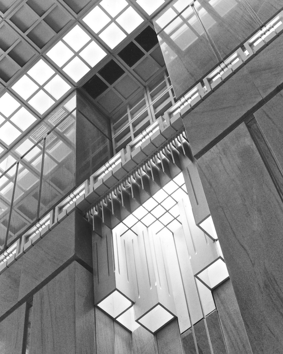 565 Fifth Avenue, 1993
———————————————————-
Visit: AAQ / Portfolio / Architecture — Norman Jaffe: Gates of the Grove Synagogue, East Hampton
Visit: AAQ / Portfolio / Architecture — Norman Jaffe: 565 Fifth Avenue, NYC
Visit: AAQ / Architecture — Norman Jaffe’s Gates of the Grove / Re-framed Portfolio
———————————————————-
Norman Jaffe: Thoughts on Architecture — not previously published. Transcribed, edited & abridged by Jeff Heatley from an interview at Norman Jaffe’s Studio, Bridgehampton, on November 28, 1983.
Interview & photographs copyright, Jeff Heatley.
____________________________________________________________
